 Sports Logo History
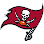
 Tampa Bay Buccaneers Primary Logo 2020 - Present
This year’s Super Bowl promises to be one for the ages. Super Bowl LV pits arguably the greatest quarterback of all-time, Tom Brady, against the brightest rising star in the NFL, last year’s Super Bowl MVP Patrick Mahomes. Brady is seeking his record seventh Super Bowl victory, while Mahomes, at just age 25, is trying to win his second straight Lombardi Trophy. If that wasn’t reason enough to tune in, this will also be the first time in history that a team hosts the Super Bowl on their home field. Tampa’s Raymond James Stadium was selected to host this year’s Super Bowl years ago, long before the Tampa Bay Buccaneers signed Tom Brady, Rob Gronkowski, or Leonard Fornette, their three-headed offensive monster.
With Tampa Bay being the talk of the NFL this year, let’s take a look at their history and specifically the history of their logo.
Team History
The Tampa Bay area first got a football team in 1976 when the league expanded, bringing on teams in both Tampa, Florida and Seattle, Washington. The Tampa team was historically bad in the beginning and didn’t win a single game until week 13 of their second season, 1977. Once they got their first win, it didn’t take long to get their second the very next week. Over the course of the 1977 and 1978 seasons, the team steadily improved and made the playoffs in their fourth season, 1979. The team made it all the way to the NFC Championship game, losing to the Los Angeles Rams 9-0.
The team made the playoffs again in 1981, but beginning in the mid-1980s the team went through one of the worst periods of any football team. The Bucs lost 10 or more games a record 12 straight seasons, from the mid-80s to the late 1990s. With the hiring of head coach Jon Gruden in 2002, the Bucs got back on track. They played so well, in fact, that 2002 was their best season as a franchise. They went 12-4 in Gruden’s first season and made their first Super Bowl appearance. In Super Bowl XXXVII, The Tampa Bay Buccaneers defeated the Oakland Raiders easily by a score of 48-21 to win their first (and only) Lombardi Trophy.
Team Logo

Tampa Bay Buccaneers Primary Logo 1976 - 1996
The name “Buccaneers” was chosen by the team ownership with the help of a local radio station that asked listeners to call in with their suggestions of names for the newly awarded NFL franchise. Buccaneers were chosen over other nautical names such as Buzzards, Coastal Tides, and Sailors. The team’s first logo was designed by legendary Tampa Tribune cartoonist Lamar Sparkman. What he created was nothing short of genius. It was a headshot of a classic swashbuckler, complete with a wide-brimmed plumed hat and a dagger clenched in his teeth. “Bucco Bruce” as he was named, had long, flowing hair, a hoop earring dangling from one ear, and a thin mustache. One eye winked mischievously. The team’s colors were orange and red, a tribute to the region’s citrus industry as well as the warmth and sunshine of the Tampa Bay area. The Buccaneers used Sparkman’s iconic logo for 21 seasons, from their inception in 1976 through the 1996 season.

Tampa Bay Buccaneers Primary Logo 1997 - 2013
For the start of the 1997 season, the Tampa Bay Buccaneers underwent a dramatic rebranding. They went away from the “creamsicle” orange-colored logo and uniforms and chose a more dramatic looking red and pewter color scheme. With the color change came a logo change. They went away from the Bucco Bruce image and chose a more aggressive-looking pirate flag theme. The Calico Jack flag featured a skull and crossed swords and a football, while the staff of the flag was also a pirate sword. The tattered flag appears to be blowing in the wind. The skull and crossed swords are clearly more aggressive than the old Bucco Bruce logo. In the mid-1990s, the Buccaneers made some historic draft picks that set them up for the future. In 1995 they drafted two future Hall of Famers in Warren Sapp and Derrick Brooks. The next year they drafted All-Pro running back Mike Alstott. At the same time of the rebranding, the Bucs also moved into a new stadium, Raymond James Stadium, and just a few years later with new head coach Jon Gruden, found themselves in their first Super Bowl.
 Sports Logo History
 Tampa Bay Buccaneers Alternate Logo 2020 - Present
In 2014 the team updated their pirate flag logo, but this time the changes were less dramatic. They kept the overall theme the same, but updated the color of the flag to a brighter red and sharpened the look of the skull and crossed swords. They also changed the sword that holds up the flag from a red color to all pewter. Those small changes are a testament to how much they like the logo and will continue to use it. The 2014 updated logo is still in use today.
The Future
It’s unclear exactly how long Tom Brady plans to play football. He was signed by the Bucs on a one-year contract. He’s 43 years old this year. It’s possible that if he wins the Super Bowl this year, he could call it quits. It’s clear, however, that the Bucs have built an excellent team around Brady, and they will be a team that competes in the future regardless of who is at quarterback. Just a few years ago there was talk about whether the Tampa Bay franchise would move cities. Now it seems that they are happy with their team, their city, their stadium, and their logo.
See the Tampa Bay Buccaneers logo history and team history.
Sports Logo History is a community of sports logo enthusiast who enjoys the history of each team’s logo history. Sports Logo History has primary logos, alternate logos, wordmark logos, or concept logos from the NFL, NBA, MLB, MLS, NHL, Premier League, WNBA, CFL, NCAA, ABA, USFL, AAF, and XFL.
Our partner site is Sports Team History takes a look at the history of each and every professional sports team.

