 Sports Logo History
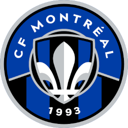
 Once again, the Montreal FC team has changed its logo. This logo change represents an effort by the club to go back to its roots. This new logo and branding will serve as the club's brand-new identifier for the 2023 season.
This decision is coming off the heels of a solid season that ended with an Eastern Conference Semifinal loss to New York City FC.
The logo stands as a bold declaration of the club's future prospects. However, it uses elements from the club's past to portray that message.
The club's finalized logo is a circular logo. According to the club, the circle symbolizes the team's unity. The exterior of the circular logo has a bold silver outline.
The primary color scheme of the circular logo is blue. It's been the predominant color of the franchise during its entire existence. Different elements of the logo separate the upper half of the circle and the lower half of the circle. The upper half of the circle contains a bold, curved "CF Montreal" wordmark in white with a solid blue background.
The lower half of the circle contains a "1993" wordmark in white. "1993" marks the year in which the franchise was founded as the Montreal Impact. The background contains blue and black stripes. The blue and black stripes are a callback to the early days of this franchise.
The center of the logo contains a shield. The shield is symbolic of the team's strength and doggedness. The shield comprises a silver outline on its exterior. The inner part of the shield includes a Fleur-de-lis with blue and black stripes in the background. The Fleur-de-lis is representative of the Quebec province.
This logo is a complete about-face from its previous branding effort.
 Sports Logo History
 In January last year, the franchise changed its name to Club De Foot Montreal. They replaced the shield logo with a snowflake full of M's with directional arrows that were used to represent the metro system in Montreal. The logo also contained a blue border that represented Montreal's rivers.
However, the logo was met with a heavy amount of criticism. This forced the franchise to go in another direction.
Certain aspects of this logo were seen in the club's previous primary logo years ago. Years ago, the club had a silver shield logo. A smaller version of this silver shield can be seen in the middle of the team's new logo.
In a similar fashion to its current logo, the previous logo has blue and black stripes on the bottom half of the logo.
Additionally, the previous logo has a Fleur-de-lis contained within the shield logo. This is in a similar fashion to the Fleur-de-lis contained within the small shield in the center of its new logo.
___
Sports Logo History is a vibrant community of sports logo enthusiasts who share a deep appreciation for the captivating histories behind each team's logo. We take pleasure in exploring the evolution of primary logos, alternate logos, and wordmark logos from renowned leagues such as the NFL, NBA, MLB, MLS, NHL, Premier League, WNBA, CFL, NCAA, UFL, ABA, USFL, AAF, and XFL. Immerse yourself in the intricate details and stories behind these iconic symbols that represent the essence of each team.
In the enthralling realm of sports, the battle of logos among different leagues unfolds as a captivating and ongoing spectacle. Step into the world of Sports Logo History, where we showcase the relentless pursuit of distinction by leagues such as the NFL, NBA, MLB, Premier League, and countless others. Witness the captivating journey as each league strives to create logos that not only capture the essence of their sport but also resonate deeply with fans.
Immerse yourself in the comprehensive sports history provided by Sports Team History, our esteemed partner site, where you can discover the triumphs, challenges, and defining moments that have shaped the legacies of professional sports teams. Stay up to date with the latest sports news through Sports News History, a platform delivering 24/7 coverage of highlights, player interviews, and game analyses. Additionally, express your unwavering support for your favorite teams by exploring Sports Store History, the premier sports team marketplace offering a vast selection of jerseys, memorabilia, and collectibles. Join our community today and celebrate the rich history, iconic logos, and passion of sports.

