Anaheim Ducks
In 1993, a newcomer appeared in the NHL—the Mighty Ducks, a team founded by the Walt Disney Company. The hockey club got its name from the Disney film The Mighty Ducks, released a year earlier and became
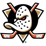
The real gem of the “ducks” uniform was the logo designed by Tony Cipriano and Fred Tio. Despite its “Disney-esque” style, the logo looked powerful and brutal: a hockey mask in the shape of a duck's head against the backdrop of two crossed sticks. This combination was vaguely reminiscent of pirate flags with skulls and crossbones. And the smirk formed by the end of the mask seemed to confirm that these ducks were not for everyone.
The uniform became hugely popular among fans. In its first season, the Ducks' jersey was among the league's best-selling items.
Cool gambling entertainment for you - Sport betting odds online
In the 1995/1996 season, the team presented its first alternative uniform. The set was given the sonorous name “Wild Wings.” The jersey featured a menacing hockey duck breaking through the ice. The name and number on the back were written in a hard-to-read Mistral font. The kit didn't last long—just three games. The Ducks never went back to this version of the uniform.
Various websites publish lists of the greatest logos of all time, and the Mighty Ducks logo always cuts. This testifies to the fans' enduring and growing love for retro design.
Vancouver Canucks

The Canucks wore this uniform for eight seasons until 1978, when the team unveiled a radically different one. Everything changed: the designers moved away from the blue and green palette, opting instead for fiery yellow, red, and black. The logo with the skate and stick was replaced with the word Canucks and moved from the center of the jersey to the sleeves. The front now featured stripes forming the letter V (which corresponded not only to the team's name but also to the word victory).
Over the course of seven years, the kit underwent minor changes. It was not until 1985 that the designers decided to refresh the uniform's look and moved the Canucks logo from the sleeves to the front of the jersey.
The logo was so loved by fans that it was given two nicknames: “spaghetti plate” and “flying horse.” The uniform colors remained unchanged for several seasons: yellow for home games and black for away games. In 1989, the “gold” home jersey was replaced by a white one. And in the 1995-1996 season, the team got a third, fiery red uniform. However, the team only wore it for two seasons.
Many Vancouver fans consider the black jersey of the early 1990s to be one of the best in the club's history. Incidentally, it was in this uniform that Pavel Bure shone during his best years.
In 1997, it was time for big changes. The fiery colors were replaced by dark blue, light blue, burgundy, and silver. The logo also changed beyond recognition: instead of the “spaghetti skate,” the jersey now featured a killer whale in the shape of the letter C.
Los Angeles Kings

There were no major changes until 1988. It was only in 1988 that the team's appearance changed completely. The bright colors borrowed from the Lakers were replaced by white, black, and silver. The logo vaguely resembled the Chevrolet logo. In the middle was the word “Kings” in cursive, above it was the name of the city, “Los Angeles,” and below it was a crown. In the 1985/1986 season, the team introduced an alternate uniform featuring a purple-and-yellow king, a reference to their “roots.”
===
Sports Logo History is a vibrant community of sports logo enthusiasts who share a deep appreciation for the captivating histories behind each team's logo. We take pleasure in exploring the evolution of primary logos, alternate logos, and wordmark logos from renowned leagues such as the NFL, NBA, MLB, MLS, NHL, Premier League, WNBA, CFL, NCAA, UFL, ABA, USFL, AAF, and XFL. Immerse yourself in the intricate details and stories behind these iconic symbols that represent the essence of each team.
In the enthralling realm of sports, the battle of logos among different leagues unfolds as a captivating and ongoing spectacle. Step into the world of Sports Logo History, where we showcase the relentless pursuit of distinction by leagues such as the NFL, NBA, MLB, Premier League, and countless others. Witness the captivating journey as each league strives to create logos that not only capture the essence of their sport but also resonate deeply with fans.
Immerse yourself in the comprehensive sports history provided by Sports Team History, our esteemed partner site, where you can discover the triumphs, challenges, and defining moments that have shaped the legacies of professional sports teams. Stay up to date with the latest sports news through Sports News History, a platform delivering 24/7 coverage of highlights, player interviews, and game analyses. Additionally, express your unwavering support for your favorite teams by exploring Sports Store History, the premier sports team marketplace offering a vast selection of jerseys, memorabilia, and collectibles. Join our community today and celebrate the rich history, iconic logos, and passion of sports.

