Since immemorial, soccer teams have rebranded their logos to improve their image. And for any soccer fan, this does not pass unnoticed. There are many ways in which fans stay committed to their teams, and getting concerned about the outlook of logos is just one of them.
For those who bet as a sign of loyalty, reading Overtime Heroics’ Betway app review is a good way to determine if this app is the right choice for your betting needs. As you continue reading, you will discover how the logos of different teams have evolved to fit various cultural contexts.
Chicago Fire FC
They released their latest logo before returning to downtown Chicago in 2020. The new logo featured new colors and a change to their name, incorporating ‘FC.’ At its center is a mirrored flame icon inspired by the city's direction after the Great Chicago Fire of 1871.
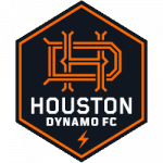
Houston Dynamo

After the 2020 season, the Houston Dynamo rebranded its logo to connect more with the city. The recent one is quite different, featuring a hexagonal shape that shows the community's strength and unity.
The city’s name is more dominant in the recent logo than in the previous one. The name ‘Houston’ is way bigger in font size than the team’s name.
D.C. United
This team's rebrand took place a while ago—about two years before signing Wayne Rooney. Unlike the other two teams, this did not significantly change its image. The newer version has a more pronounced eagle shape, and the soccer ball in the previous one was replaced with three stars and two stripes, taken from the District flag.
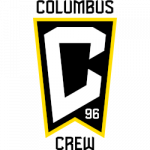
Columbus Crew

Towards the end of 2014, the Columbus Crew unveiled a major update to its logo. Only the logo’s traditional black and gold colors remained; every other element was revamped. This was just a year after Precourt Sports Ventures, the team's then-owner, welcomed a new head coach, Gregg Berhalter.
The circular logo represents the city’s German heritage, while the black and gold colors point to the fans' culture at Crew SC. The two rings correspond with the 'O' in the Ohio State flag, whereas ‘96’ points to the year the club was founded.
San Jose Earthquakes
To celebrate its 40th anniversary, Earthquakes unveiled a new logo in 2014 that would reunite the team with its traditions. The update included its year of formation and some tweaks to the name.
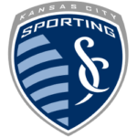
Sporting Kansas City

Sporting Kansas is another team that has made significant changes to its logos. The change was not just in its logo, but also in its name. The 11 stripes show the complete number of players on the field. Other elements drew inspiration from ancient Greek mythology, art, and Spanish architecture.
While this list shows the MLS teams that have rebranded in the past, other teams, such as the LA Galaxy, have also done so. As more Americans continue to turn to soccer for entertainment, we can expect other teams to revamp their images to better connect with fans.
___
Sports Logo History is a vibrant community of sports logo enthusiasts who share a deep appreciation for the captivating histories behind each team's logo. We take pleasure in exploring the evolution of primary logos, alternate logos, and wordmark logos from renowned leagues such as the NFL, NBA, MLB, MLS, NHL, Premier League, WNBA, CFL, NCAA, UFL, ABA, USFL, AAF, and XFL. Immerse yourself in the intricate details and stories behind these iconic symbols that represent the essence of each team.
In the enthralling realm of sports, the battle of logos among different leagues unfolds as a captivating and ongoing spectacle. Step into the world of Sports Logo History, where we showcase the relentless pursuit of distinction by leagues such as the NFL, NBA, MLB, Premier League, and countless others. Witness the captivating journey as each league strives to create logos that not only capture the essence of their sport but also resonate deeply with fans.
Immerse yourself in the comprehensive sports history provided by Sports Team History, our esteemed partner site, where you can discover the triumphs, challenges, and defining moments that have shaped the legacies of professional sports teams. Stay up to date with the latest sports news through Sports News History, a platform delivering 24/7 coverage of highlights, player interviews, and game analyses. Additionally, express your unwavering support for your favorite teams by exploring Sports Store History, the premier sports team marketplace offering a vast selection of jerseys, memorabilia, and collectibles. Join our community today and celebrate the rich history, iconic logos, and passion of sports.

