As one of the most recognizable teams in the NBA, the Los Angeles Lakers have gone through a number of logo changes over the years.
From their early days in Minneapolis to their current home in LA, the Lakers' logo has evolved alongside the team's successes and struggles. Each iteration of the logo reflects the team's history, culture, and identity, making it a fascinating study in design and branding.
In this article, we'll take a closer look at the evolution of the Lakers logo and explore the stories behind each iteration. Whether you're a die-hard LA Lakers fan, a sports betting enthusiast who regularly places wagers on sites like UFA100, or simply someone interested in the evolution of logo design, this article is the ideal opportunity to learn more about one of the NBA's most iconic teams.
Read on and discover the history behind the Lakers logo!
Early Years (1948-1960)

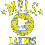
Minneapolis Lakers Primary Logo 1948 - 1960
Although LA Lakers have hundreds of thousands of fans all over the world, not many know that this team hasn't always been based in Los Angeles. In fact, the first time the team used the moniker 'Lakers' was when they were still based in Minneapolis. Because of that, the very first Lakers logo was also used when the team was still playing in Minnesota.
Although this logo was much less striking than the ones we know and love today, it still holds a special place in Lakers' history. The central feature of the logo is a yellow basketball with a white map of Minnesota inside it, complete with the state's name written across the middle.
The top half of the logo contains the name 'MPLS' in yellow lettering with a blue outline and a dot at the end, complete with two stars at both ends of the word. The bottom part simply reads 'LAKERS', written in the same coloring scheme as the top half.
The Lakers have been using this logo for over 12 years, until the year 1960 when the team finally moved to Los Angeles.
'60s and '70s (1961-1976)

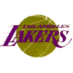
Los Angeles Lakers Primary Logo 1961 - 1976
After the team's move to Los Angeles in 1960, the Lakers' logo went through a significant redesign to reflect their new name and home. The most prominent feature of the previous logo, the basketball, was kept and given a more modern look.
The yellow color of the basketball gave way to a grainy, greenish-yellow hue, and the white map of Minnesota was removed - an understandable decision given the team's new location.
The above and below elements of the previous logo naturally didn't make it to this iteration. Instead, a more centralized and modern wordmark spelling 'LOS ANGELES LAKERS' in vibrant purple was used.
Furthermore, unlike the previous 'MPLS' and 'LAKERS', the new wordmark was written in a much larger typeface and included subtle blur lines to give it a more dynamic look.
This logo was used by the team for 15 years until 1976 when the LA Lakers decided to go through another rebranding.
Third Logo (1977-2001)

Los Angeles Lakers Primary Logo 1977 - 2001
1977 saw a minor yet visually appealing update to the classic Lakers logo we all know and love today. The main change was made to the basketball itself, which was no longer dirty yellow-green: instead, it became a striking orange-gold color. In addition to the color change, the basketball was also given a slightly more three-dimensional look.
The wordmark also hasn't seen major redesign changes and is still spelled 'LOS ANGELES LAKERS' in purple lettering with similarly colored blur lines. However, unlike the previous version, the hue of the 'LOS ANGELES LAKERS" was much less intense, giving it a slightly washed-out aesthetic.
This logo was used by the team for an impressive 24 years until 2001 when the modern iteration of the logo was finally introduced.
Modern Emblem (2002-Present)
Los Angeles Lakers Primary Logo 2002 - Present
The biggest change made to the logo was the hue - both the basketball and the wordmark were given a more vibrant and saturated look. This boosted the clarity of the Lakers' emblem and made it more intelligible to the human eye.
Wrap Up
The Los Angeles Lakers are one of the most recognizable teams in the NBA, and their logo is just as iconic as the team itself. From their humble beginnings in Minneapolis to their current home in LA, the Lakers' logo has undergone a number of changes to reflect the team's evolving identity. Each iteration of the logo tells its own story, making it a fascinating study in design and branding.
Of course, this is not the end of the story - the current emblem has been proudly representing the Lakers for the last 20 years, so sooner or later, we might see another facelift. We can only hope that the next iteration will be just as striking and memorable as the ones that came before it!
Sports Logo History is a community of sports logo enthusiast who enjoys the history of each team’s logo history. Sports Logo History has primary logos, alternate logos, or wordmark logos from the NFL, NBA, MLB, MLS, NHL, Premier League, WNBA, CFL, NCAA, ABA, USFL, AAF, and XFL.
One of our partner sites Sports Team History takes a look at the history of each and every professional sports team. In addition, we have added Sports News History to our sports history websites. 24/7 non-stop sports news that's worth knowing. Finally, the premier sports team marketplace for your favorite team or college with thousands of items for you to peruse at Sports Market History.

