It is no secret that the longevity and staying power of a logo have a lot to do with the success of a brand. For example, the Coca-Cola brand was established during the latter half of the 19th century with its infamous cursive logo. The Coca-Cola brand is still going strong today. Thus, its logo is a symbol of that success. The same could be said for brands such as General Electric and Johnson & Johnson.
This could be seen in sports as well. The Montreal Canadiens have had a similar logo format since the 1910s. However, it's not a surprise given that the Canadians are the all-time leader in Stanley Cups with 23.
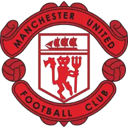
In terms of a team with a logo that is synonymous with its success, I could think of fewer examples more appropriate than Manchester United. As you'll see, their current logo has had decades of staying power because Manchester United's team history is synonymous with success.
For Manchester United fans seeking to get down to the origins of their current logo format, one will have to take a trip back in time all the way to the 1940s.
 Sports Logo History
 Manchester United FC Primary Logo 1943 - 1960
In 1943, Manchester United adopted the first version of the crest we know today. However, the color scheme was red and black. The banner on top of the logo had a "MANCHESTER UNITED" wordmark on the top with a banner on the bottom while the "FOOTBALL CLUB." The color schemes of both wordmarks are both black.
In between the logo are a shield with a red ship on the upper half and a red devil with its pitchfork on its lower half. This logo lasted for seventeen years.
After that, the Manchester United logo would be altered due to a change in the color scheme. The top banner was red with a black “Manchester United” wordmark, while the bottom banner was white with a black “Football Club” wordmark. The middle of the logo contains a shield with a black ship at the top, while the lower half contains a red banner. This logo would last until 1970.
In 1970, Manchester United altered the color scheme of this logo format to the red and yellow color scheme that still exists today.
The top and bottom banners are both red, while their respective wordmarks, “MANCHESTER UNITED” and “FOOTBALL CLUB,” are yellow. A yellow soccer ball can be seen on either side of the logo. The middle of the logo has a shield with a yellow ship and a red and yellow striped banner on the bottom. This would last until 1973.
In its next logo, the football club would modify the font of the “MANCHESTER UNITED” and “FOOTBALL CLUB.” The logo's middle had a yellow shield with a yellow ship on the upper half and a red devil with a pitchfork on the bottom. This logo would be until 1998.
 Sports Logo History
 Manchester United FC Primary Logo 1998 - Present
In 1998, the football club modified its logo by only having a “MANCHESTER” wordmark on the top banner and “UNITED” wordmark on the bottom club. The shield with a yellow ship and a red devil can be seen, but there were some slight modifications in the background color. The franchise’s current logo has been around for nearly a quarter century.
Based on the Premier League results over the past few decades, I don’t blame Manchester United for sticking with the color scheme.
Manchester United has been the most successful franchise in the history of the Premier League since its inception in 1992. They have won 13 Premier League Championships. Furthermore, they have twice as many Premier League championships as every other team in the league’s history.
Manchester United took this league by force when it first started. They won four Premier League titles in the first five years. (1992-1993, 1993-1994, 1995-1996, 1996-1997). Not too long after that, Manchester United would win three straight Premier League titles (1998-1999, 1999-2000, 2000-2001)
In totality, Manchester United won 7 of the league’s first 9 championships. In 1998-1999, Manchester United had the distinction of winning the Premier League, FA Cup, and the UEFA Champions League.
Teams usually drastically change a logo when a franchise needs a change in direction and identity. However, Manchester United is the 4th most valuable soccer team on the planet. They are a publicly traded entity.
Therefore, there is no reason to change the logo format drastically with a brand representing success and prestige. If you disagree, perhaps NFL betting is more your thing.
Sports Logo History is a community of sports logo enthusiast who enjoys the history of each team’s logo history. Sports Logo History has primary logos, alternate logos, or wordmark logos from the NFL, NBA, MLB, MLS, NHL, Premier League, WNBA, CFL, NCAA, ABA, USFL, AAF, and XFL.
Our partner site is Sports Team History takes a look at the history of each and every professional sports team. In addition, we have added Sports News History to our sports history websites. 24/7 non-stop sports news that's worth knowing. Finally, the premier sports team marketplace for your favorite team or college with thousands of items for you to peruse at Sports Market History.

