When one thinks of the Utah Jazz, one cannot help but think about one of the greatest duos in NBA History: Karl Malone and John Stockton. Over the years, Utah Jazz has had many changes to its primary logo and brand identifiers throughout its franchise history ever since it started in New Orleans.
Two days ago, Utah Jazz announced sweeping changes to its logos.
In order to get a broader perspective of the Jazz’s pending logo change, let’s take a look back at the logo history of the Utah Jazz. The first logo in franchise history lasted from 1975-1979. This logo is accentuated by the wordmark “JAZZ.” The letter J contains a basketball that is colored black, yellow, and red. Additionally, the letter J seems to resemble a musical note.
The wordmark “JAZZ” is in purple. One will notice that there is a broken “A, “Z” AND Z” in this wordmark. Additionally, one cannot help but look at the purple “NEW ORLEANS” wordmark above the “JAZZ” wordmark.
In 1980, the franchise would modify its logo once it moved to Salt Lake City, Utah. It was a very simple change. They removed the wordmark “NEW ORLEANS” from the top of their logo and replaced it with “UTAH.” The color for this wordmark is also purple. This logo lasted until 1996.
In 1997, Utah Jazz would do a drastic change with regard to their logo. This logo contains a streaky “JAZZ” wordmark that was both colored blue and purple. The “JAZZ” logo was perfectly positioned against the mountains that can be seen in the background of the logo. The logo was positioned in the middle of a copper circle. This logo lasted until 2004.
From 2005-2010, Utah Jazz would keep the same logo format. The major modification to their logo was to incorporate the franchise’s new color scheme. Their new scheme consisted of light blue, navy blue, purple, and silver. Another key change is that the “JAZZ” wordmark is no longer streaking. A silver “UTAH” wordmark can be seen on top.
Just like its predecessor, the franchise would keep the same logo format, yet change the color scheme. The “JAZZ” wordmark changed from purple to white with a yellow outline. Additionally, the color of the “UTAH” wordmark was changed to white. This logo lasted from 2010-2015.
From 2016 to now, the franchise would go back to the aforementioned logo format that lasted from 1980-1996.
 Sports Logo History
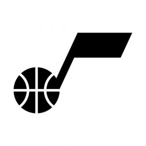
 On Wednesday, Utah Jazz revealed a new logo that has the aforementioned “J” wordmark that resembles a musical note and has a basketball within it. This wordmark is on top. On the bottom of the logo, A black “UTAH JAZZ” wordmark can be seen.
The color scheme for this logo is black except for when the logo can be seen on black apparel. In such a case, the logo will be white. The logo is really simple and minimal.
The “J” wordmark will be Jazz’s new primary icon. The team’s new wordmark logo is a vertical illustration of the word “UTAH JAZZ”. The “UTAH” wordmark can be seen on top while the “JAZZ” wordmark is on the bottom.
Sports Logo History is a community of sports logo enthusiast who enjoys the history of each team’s logo history. Sports Logo History has primary logos, alternate logos, or wordmark logos from the NFL, NBA, MLB, MLS, NHL, Premier League, WNBA, CFL, NCAA, ABA, USFL, AAF, and XFL.
Our partner site is Sports Team History takes a look at the history of each and every professional sports team. In addition, we have added Sports News History to our sports history websites. 24/7 non-stop sports news that's worth knowing. Finally, the premier sports team marketplace for your favorite team or college with thousands of items for you to peruse at Sports Market History.
When one thinks of the Utah Jazz, one cannot help but think about one of the greatest duos in NBA History: Karl Malone and John Stockton. Over the years, Utah Jazz has had many changes to its primary logo and brand identifiers throughout its franchise history ever since it started in New Orleans.
Two days ago, Utah Jazz announced sweeping changes to its logos.
In order to get a broader perspective of the Jazz’s pending logo change, let’s take a look back at the logo history of the Utah Jazz. The first logo in franchise history lasted from 1975-1979. This logo is accentuated by the wordmark “JAZZ.” The letter J contains a basketball that is colored black, yellow, and red. Additionally, the letter J seems to resemble a musical note.
The wordmark “JAZZ” is in purple. One will notice that there is a broken “A, “Z” AND Z” in this wordmark. Additionally, one cannot help but look at the purple “NEW ORLEANS” wordmark above the “JAZZ” wordmark.
In 1980, the franchise would modify its logo once it moved to Salt Lake City, Utah. It was a very simple change. They removed the wordmark “NEW ORLEANS” from the top of their logo and replaced it with “UTAH.” The color for this wordmark is also purple. This logo lasted until 1996.
In 1997, Utah Jazz would do a drastic change with regard to their logo. This logo contains a streaky “JAZZ” wordmark that was both colored blue and purple. The “JAZZ” logo was perfectly positioned against the mountains that can be seen in the background of the logo. The logo was positioned in the middle of a copper circle. This logo lasted until 2004.
From 2005-2010, Utah Jazz would keep the same logo format. The major modification to their logo was to incorporate the franchise’s new color scheme. Their new scheme consisted of light blue, navy blue, purple, and silver. Another key change is that the “JAZZ” wordmark is no longer streaking. A silver “UTAH” wordmark can be seen on top.
Just like its predecessor, the franchise would keep the same logo format, yet change the color scheme. The “JAZZ” wordmark changed from purple to white with a yellow outline. Additionally, the color of the “UTAH” wordmark was changed to white. This logo lasted from 2010-2015.
From 2016 to now, the franchise would go back to the aforementioned logo format that lasted from 1980-1996.
 Sports Logo History
 On Wednesday, Utah Jazz revealed a new logo that has the aforementioned “J” wordmark that resembles a musical note and has a basketball within it. This wordmark is on top. On the bottom of the logo, A black “UTAH JAZZ” wordmark can be seen.
The color scheme for this logo is black except for when the logo can be seen on black apparel. In such a case, the logo will be white. The logo is really simple and minimal.
The “J” wordmark will be Jazz’s new primary icon. The team’s new wordmark logo is a vertical illustration of the word “UTAH JAZZ”. The “UTAH” wordmark can be seen on top while the “JAZZ” wordmark is on the bottom.
___
Sports Logo History is a vibrant community of sports logo enthusiasts who share a deep appreciation for the captivating histories behind each team's logo. We take pleasure in exploring the evolution of primary logos, alternate logos, and wordmark logos from renowned leagues such as the NFL, NBA, MLB, MLS, NHL, Premier League, WNBA, CFL, NCAA, UFL, ABA, USFL, AAF, and XFL. Immerse yourself in the intricate details and stories behind these iconic symbols that represent the essence of each team.
In the enthralling realm of sports, the battle of logos among different leagues unfolds as a captivating and ongoing spectacle. Step into the world of Sports Logo History, where we showcase the relentless pursuit of distinction by leagues such as the NFL, NBA, MLB, Premier League, and countless others. Witness the captivating journey as each league strives to create logos that not only capture the essence of their sport but also resonate deeply with fans.
Immerse yourself in the comprehensive sports history provided by Sports Team History, our esteemed partner site, where you can discover the triumphs, challenges, and defining moments that have shaped the legacies of professional sports teams. Stay up to date with the latest sports news through Sports News History, a platform delivering 24/7 coverage of highlights, player interviews, and game analyses. Additionally, express your unwavering support for your favorite teams by exploring Sports Store History, the premier sports team marketplace offering a vast selection of jerseys, memorabilia, and collectibles. Join our community today and celebrate the rich history, iconic logos, and passion of sports.

