 Sports Logo History
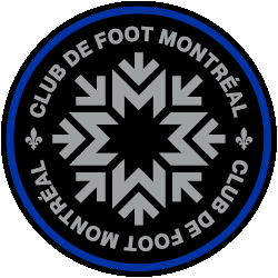
CF Montréal Primary Logo 2021 - Present
It is no secret that CF Montreal has heard all the criticism and the negativity with regards to their crest. Now, they have decided to take action to change the narrative.
On the team’s Twitter page, the team announced that they will be making a new crest for the 2023 season. They have vowed that they will highlight the key aspects of the team’s identity in their next design.
In order to gain context, it is important to compare their old logo vs their new logo. With regards to their old logo, the logo stands out as it is reminiscent of a silver shield. It is shaped like a shield. Additionally, the logo has an outline that is colored silver. On the top of the logo, one will notice that the wordmark “Tous Pour Garner” can be on top of the shield. Tous Pour Garner stands for “All to Win” in French.
The logo has a blue background. Additionally, the upper half of the logo has a white fleur-de-lis. This fleur-de-lis is similar to the one that the New Orleans Saints have. Additionally, there are four stars that are formatted in a semi-circle and are near the fleur-de-lis.
The four stars symbolize Montreal’s original settlers. Those settlers are the English, Dutch, Scottish and Irish.
A wordmark that displays “Impact Montreal” can be seen across the midsection of the logo with a black background. The “IMPACT” is colored in gray and has a smaller font while the “MONTREAL” is colored white and has a bigger font that covers the middle of the logo. The bottom half of their old logo consists of blue and black stripes.
On January 14th, 2021, the team would introduce their current crest. The logo has a black exterior outline. It is closely preceded by a blue circular outline. The purpose of the blue outline is to show that Montreal is an island. The interior consists of a black background and has a wordmark that says “Club de Foot Montreal.” Two green fleur-de-lis’s can be seen on the far left and far right of the logo.
A snowflake can be seen in the middle of the logo. If one takes a closer look, the snowflake is a series of M’s that is meant to stand for Montreal. Directional arrows can be seen around the snowflake. The arrows symbolized the transportation system of Montreal.
However, this current logo was met with heavy criticism. The criticism of the team’s logo has come from their most diehard supporters. An example of that could be seen in a group known as Ultras Montreal. Ultras Montreal is a group of diehard supporters of CF Montreal. They were not pleased with the team’s original rebrand at all. One member commented that the change came at the expense of the team’s history prior to the change. Betrayed by the team’s change, Ultras Montreal put together a petition in over 5,000 people signed.
Sports Logo History is a community of sports logo enthusiast who enjoys the history of each team’s logo history. Sports Logo History has primary logos, alternate logos, or wordmark logos from the NFL, NBA, MLB, MLS, NHL, Premier League, WNBA, CFL, NCAA, ABA, USFL, AAF, and XFL.
Our partner site is Sports Team History takes a look at the history of each and every professional sports team. In addition, we have added Sports News History to our sports history websites. 24/7 non-stop sports news that's worth knowing. Finally, the premier sports team marketplace for your favorite team or college with thousands of items for you to peruse at Sports Market History.

