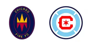
For the second time since the team’s inception in 1997, Major League Soccer’s Chicago Fire will unveil a new logo and overall look to kick off the 2022 season.
Although Chicago is home to several professional sports teams, the Fire is a unique one that tends to be overshadowed. However, with this new crest, the organization aims to better connect with the city and its surrounding areas.

First and foremost, this connection is achieved by incorporating the primary colors and key aspects of the Chicago flag. These aspects have been synonymous with Chicago for a long time, so leveraging that appeal is very smart.
“Inspired by the collective voice of our fans and supporters,” the Fire tweeted about the new logo. “Rooted in our history, created for generations of Chicagoans to come.”
One aspect that remains unchanged is the red letter “C” that has been on the Fire’s crest since the team was formed. The shade of red is slightly changed, but the build remains the same. The most notable change is the addition of Chicago blue, as well as the overall shape. This one takes on a more circular shape with a dark outline around the build of the logo to tie it all together.
In the old logo, the traditional firefighters' crest was the central part of the body. With the new version, this is much more subtle. The Chicago blue is featured on a more circular, skinnier firefighters logo surrounding the letter "C."
Finally, a red star is positioned right in the middle to draw your eyes to the center of the logo.
Along with the primary logo being changed, the secondary ones have also been engineered to fit the new brand overall. One of which is simply “Chicago Fire FC” in white script. Although this may not be considered an actual logo to some, it is still worth mentioning.
In terms of more traditional logo designs, three secondary options accompany the new branding. One is the MLS logo outfitted with the new red and blue colors. Every team has a version of this look, and the new Chicago one is clean.
There is also "FIRE" in red with a blue bar above and below the lettering. The final secondary logo is a wheel-like design with red on the inside and blue around the outside. It is effortless but does a good job of complementing the overall look that comes with the new branding.
Rebrandings and logo changes have become increasingly common in the MLS in recent years. This is because the league is working hard to capture mainstream attention and update some outdated looks. Many MLS teams were founded just 20-30 years ago, so there have been few changes since then. The Fire is just the most recent to switch it up and bring the look into modern times.
See the Chicago Fire FC logo history.
The $17 Million Caitlin Clark Effect: How One Rookie Changed the WNBA Forever
Visit Our YouTube Channel
