No season goes on without a single team changing its primary logo, sometimes with a complete overhaul of its brand. But not all changes are received with enthusiasm by fans.
Yes, some changes are met with open arms and get their well-deserved praise. Others, however, quickly become a source of frustration and sometimes even anger.
So, today, let’s pay tribute to all those logos that teams decided to drop – but fans couldn’t let go of (the same way students can’t quit the writing help by EssayPro, too). Here are six of them that are still being missed.
Buffalo Sabres’ Goathead Logo (1996 / 1999 - 2006)
 Sports Logo History
 These years are dubbed the “black and red era.” That’s because Buffalo Sabres switched from its blue and golden color palette to black and red. This move was meant to celebrate the 25th anniversary of the team – and a move to a new arena, too.
The new logo unveiled for the 1997 season quickly gained recognition and was dubbed the Goathead. It was a white buffalo head with red, silver, and black accents.
After two seasons, the shade of red was switched to a darker one. But that’s about the only change made to the Goathead before Buffalo Sabres reinvented its symbol in 2006.
However, the Goathead was so popular that the ice hockey team couldn’t let go of it forever. Buffalo Sabres announced it would make a comeback for the 2022/23 season. It’ll serve as the alternate and jersey logo but not the primary one.
Hartford Whalers’ W & Whale Tail (1993 - 1997)

Hartford Whalers Primary Logo 1993 - 1997
Even if you’re a high school student interested in sports, the name of this NHL team probably won’t even mean anything to you. But you may know them under their current name, Carolina Hurricanes.
Before the Whalers moved to Carolina and got a complete rebrand, they were known as Hartford Whalers. And even though a couple of decades have passed, fans still wear the team’s logo on their jerseys and other apparel.
The symbol itself was simple yet powered with symbolism. You can see the green W at the bottom, a blue whale’s tail at the top, and the H that’s formed between them against a silvery background. Just this use of the negative space deserves praise – a few teams can pull this off today.
New England Revolution’s Star Spangled Banner (1996 / 2000 / 2009 - 2021)
 Sports Logo History
 New England Revolution Primary Logo 1996 - 1999
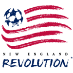
The year 2022 saw the total overhaul of this soccer team’s brand; not all fans are on board with it. Since the New England Revolution’s foundation, the team has been represented by a logo resembling Red, White, and Blue – the core symbol of America.
The whole image has a chalk drawing feel to it. There are red stripes with white space between them. Instead of the 50 stars, you’ll see a football with stars making up its pattern. The first two iterations of the logo contained the team's name at the bottom, but it was removed in 2009.
The New England Revolution logo looks nothing like the Star-Spangled Banner. It was replaced with a circle. That circle contains a capital R in the center, wrapped by a red ribbon, with the team’s name and foundation year around it. That’s a radical change, but radical doesn’t always mean better.
Cleveland Indians’ Chief Wahoo (1979 / 1986 - 2013)

Cleveland Indians Alternate Logo 1979 - 1985
Let’s be clear: this logo is problematic. And the whole rebranding that the now Cleveland Guardians undertook in 2022 was necessary to avoid both bad press and the scolding of activist groups online and offline.
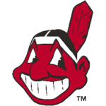
But that doesn’t mean that fans managed to move on and let Chief Wahoo go. After all, this Chief Wahoo imagery symbolized the Cleveland Indians for over three decades. And there were four other versions of Chief Wahoo symbols before that, starting from 1946.
Its wide cartoonish grin and big eyes quickly became unmistakable. The mascot became synonymous with this baseball team, so much so that without Chief Wahoo, there could be no Cleveland Indians.
This logo – Chief Wahoo’s head facing left head had to be tweaked only once. Before the 1986 season, the colors were adjusted: the red was turned brighter to provide more contrast.
Washington Redskins’ Native American (1983 - 2019)

Washington Redskins Primary Logo 1983 - 2020
This image had to go because of how problematic it became over the years. And it’s not just the logo that had to be dropped! The football team abandoned the name Washington Redskins and spent two seasons as just the Washington Football Team. In 2022, it finally rebranded itself into the Washington Commanders.
Despite that, the fans will still remember the team by its long-running name – and the respective logo. It portrays a profile of a Native American in a yellow circle, with feathers hanging on the left.
The symbol remained unchanged for over three decades, and the name has been there since 1937. So, it’s no wonder why fans have difficulty letting go of it.
Brown Bears’ Roaring Beast (2009 / 2018 - 2022)
 Sports Logo History
 In 2022, the Brown Bears unveiled a new minimalistic logo that’ll serve as their primary one. That logo is a brown block B, outlined with a thinner white line and a bolder red one. It’s supposed to become a reimagination of the Brown Bears’ brand identity, designed to ponder to its young fans.
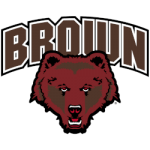
But there’s no way fans will forget this student-athlete team’s long-running symbol with a roaring bear head and the arched word Brown written in that famous block font on top. Its first iteration saw the light in 2009 and became a hit with the fans. After all, it reflected the Bears’ spirit so well.
In 2018, that image was tweaked a bit – although if you don’t compare the two versions side by side, you won’t notice it. What changed? The white outline was added, plus the shade of red and some facial details were altered.
Wrap Up
Of course, not all logos can stand the test of time. It’s better for most 1930s and 1940s logos to remain history. Others have to be changed because of the controversies surrounding them today.
That said, sometimes, those changes are uncalled for. Sometimes, marketing teams are trying to fix something that’s not broken.
And these six aren’t even the only logo changes that made fans wail and want the old image back! Here are three more examples that you may be familiar with:
- New England Patriots Patriot Pat about to hike the football (1960 / 1972 / 1989 - 1992);
- Texas A&M Aggies’ maroon ATM (1981 / 2000 / 2009 / 2016 - 2021);
- Memphis Tigers’ navy blue and orange tiger jumping from a block M (1993 - 2021).
Some teams, however, seem to have hit a goldmine a while ago. Their logos haven’t changed for decades, and they roll with that imagery, continuing to capitalize on it. Here are just a few examples that could be a lesson for some teams who change their symbols too often:
- Dallas Cowboys’ navy blue star (1964 - present);
- Chicago Cubs’ circled red capital C followed by u-b-s (1979 - present);
- Chicago White Sox’s black calligraphic Sox outlined with white and silver lines (1991 - present);
- Boston Red Sox’s pair of red socks (2009 - present);
- Chicago Bulls’ red bull head (1967 - present).
___
Sports Logo History is a vibrant community of sports logo enthusiasts who share a deep appreciation for the captivating histories behind each team's logo. We take pleasure in exploring the evolution of primary logos, alternate logos, and wordmark logos from renowned leagues such as the NFL, NBA, MLB, MLS, NHL, Premier League, WNBA, CFL, NCAA, UFL, ABA, USFL, AAF, and XFL. Immerse yourself in the intricate details and stories behind these iconic symbols that represent the essence of each team.
In the enthralling realm of sports, the battle of logos among different leagues unfolds as a captivating and ongoing spectacle. Step into the world of Sports Logo History, where we showcase the relentless pursuit of distinction by leagues such as the NFL, NBA, MLB, Premier League, and countless others. Witness the captivating journey as each league strives to create logos that not only capture the essence of their sport but also resonate deeply with fans.
Immerse yourself in the comprehensive sports history provided by Sports Team History, our esteemed partner site, where you can discover the triumphs, challenges, and defining moments that have shaped the legacies of professional sports teams. Stay up to date with the latest sports news through Sports News History, a platform delivering 24/7 coverage of highlights, player interviews, and game analyses. Additionally, express your unwavering support for your favorite teams by exploring Sports Store History, the premier sports team marketplace offering a vast selection of jerseys, memorabilia, and collectibles. Join our community today and celebrate the rich history, iconic logos, and passion of sports.
