Alternate Logos
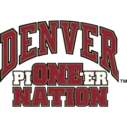
Denver Pioneers
Arched wordmark "DENVER" in crimson with gold and black trim above "ONE NATION" in crimson with gold and black trim and "PIONEER" with "PIER" in white gold and black trim and "ONE" in crimson with gold and black trim.
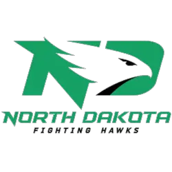
North Dakota Fighting Hawks
Custom fonts for the initials "ND" in green with a hawk's head in bedded in the initials in white with black highlights above the wordmark "NORTH DAKOTA" in green and "FIGHTING HAWKS" in black.
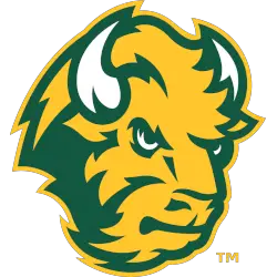
North Dakota State Bison
A bison's head in green, yellow and white.
New shade of yellow and design.
Created by Joe Bosack & Co.
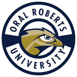
Oral Roberts Golden Eagles
A golden eagle's head inside a roundel with arched wordmark "ORAL ROBERTS UNIVERSITY" in navy, gold, and dark gold.

College Sports Fan Products


You may be familiar with the Summit League’s logo as a sports fan. But did you know that this isn’t the only logo they have ever had? The Summit League has gone through several logos in its history, each representing something unique about the league and its teams. In this blog post, we will look at some of these alternate logos and explore their significance to the league.
The first alternate logo for The Summit League was designed in 1992 when it was known as the Mid-Continent Conference (MCC). This design featured an eagle soaring over a mountain range with “Mid-Continent Conference” written in bold. This symbolized strength and power while recognizing that many of MCC's members were near mountains or other natural features like rivers or lakes.
The following change came in 1997 when MCC changed its name to The Great Midwest Athletic Conference (GMAC), which lasted until 2001 before changing to the Midwestern Collegiate Sports Association (MCSA). During this period, two new designs were introduced: one featuring just an eagle head on top of crossed swords and another featuring three blue stars above two red stripes inside a shield shape – symbols meant to represent unity among GMAC schools despite their geographic differences.
Finally, in 2007, when MCSA changed names once more, becoming what is now known as The Summit League, there was yet another redesign which included four interlocking circles around five stars arranged vertically within them – symbolizing collaboration between all member institutions regardless of size or location within North America. As well as being used on merchandise such as t-shirts, hats, mugs, etc., this design is still used today by many universities affiliated with TSL - including South Dakota State University, whose official seal includes elements taken from the original Summit League emblem. So whether you are cheering for your favorite team at home wearing apparel sporting any version of past, present, or future, rest assured knowing that every single iteration carries weighty symbolism behind it!
