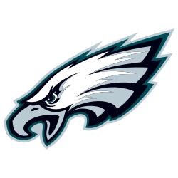
The Philadelphia Eagles have one of the most recognizable logos in professional football. Even casual fans can spot the sharp eagle’s head. It didn’t happen overnight — the logo evolved over decades but stayed true to the identity and grit of the city. More than a team symbol, it reflects tradition and visual clarity — qualities that matter in branding, from pro team logos to trusted icons on services like SlotsUp Botswana, where recognition is everything.
A Logo That Reflects the City
Philadelphia isn’t flashy. The city is tough, loyal, and proud — and the Eagles logo captures that. Since 1933, the name and design have drawn from the blue eagle emblem of the National Recovery Administration (NRA), a New Deal agency. The original version showed a blue eagle clutching a football. By the late 1930s, green became the team's signature color.
The most iconic version arrived in 1996: the sharp profile of a bald eagle with a fierce eye and hooked beak, looking left. That detail matters. It’s the only NFL logo that faces left, and it makes the eagle look like it’s flying into the past rather than the future. For fans, it reads like a visual connection to tradition, history, and the team’s legacy.
Key Reasons It Still Works
Most franchises update their logo every few years. The Eagles haven’t touched the main design since 1996. That’s not by accident. Several specific design decisions helped the logo last this long without going stale.
1. Unique Direction and Shape
- The eagle's left-facing design makes it stand out instantly.
- Its sharp features give it motion and power.
- The tucked feathers form a subtle "E," tying back to the team name.
Every visual choice connects to the team. There's no filler. Nothing is generic. That clarity keeps the logo strong year after year.
2. Solid Color System
- Midnight green replaced the earlier Kelly green in 1996.
- Silver, black, and white add contrast and intensity.
- The palette is consistent across helmets, jerseys, and branding.
This set of colors isn’t trendy. It doesn’t chase hype. It holds up under stadium lights, in print, and on screens. That reliability matters.
3. Minimal But Not Boring
- There are no flames, swooshes, or cartoonish effects.
- The design stays bold without clutter.
- Clean lines support easy recognition at any size.
Modern updates in sports branding often add more visual effects. The Eagles went the other direction. That discipline is a big part of the logo’s endurance.
Subtle Tweaks, Not Overhauls
 Since 1996, the team has made only small adjustments. A recent one involved a typeface change for the wordmark in 2022. It swapped a gothic-style font for a simpler, cleaner look. But the eagle's head stayed untouched.
Even with uniform experiments, the logo hasn’t budged. Black alternate helmets were introduced in 2022. Retro Kelly green throwbacks officially returned in 2023. Still, no redesign.
This decision keeps the brand identity anchored. Jerseys rotate. Players move on. But the symbol stays. That kind of visual consistency builds emotional equity — it becomes part of the fan experience.
Lessons from the Eagles Logo
Few NFL teams can say their main logo has stayed untouched for almost 30 years. That kind of branding longevity is rare, especially when the pressure to "refresh" is always there. But the Eagles have shown that when something works, you don't mess with it.
Here’s what others can learn from the Eagles' approach:
- Build a design with intention. Every shape and color should have a meaning.
- Be consistent. Repetition builds trust.
- Respect the audience. Fans notice when changes feel unnecessary or disconnected.
That philosophy has helped the Eagles build not just a fan base, but a full brand identity. And in a league where some teams chase seasonal redesigns or logo overhauls, the Eagles’ restraint makes them stand out even more.
A Symbol That Earned Its Place
Logos don’t become iconic through design alone. The Eagles' logo earned its place through years of rivalries, memorable games, and smart design. It connects generations, holds steady as the league shifts, and shows that real staying power comes from clarity and intent — not passing trends.
===
Sports Logo History is a vibrant community of sports logo enthusiasts who share a deep appreciation for the captivating histories behind each team's logo. We take pleasure in exploring the evolution of primary logos, alternate logos, and wordmark logos from renowned leagues such as the NFL, NBA, MLB, MLS, NHL, Premier League, WNBA, CFL, NCAA, UFL, ABA, USFL, AAF, and XFL. Immerse yourself in the intricate details and stories behind these iconic symbols that represent the essence of each team.
In the enthralling realm of sports, the battle of logos among different leagues unfolds as a captivating and ongoing spectacle. Step into the world of Sports Logo History, where we showcase the relentless pursuit of distinction by leagues such as the NFL, NBA, MLB, Premier League, and countless others. Witness the captivating journey as each league strives to create logos that not only capture the essence of their sport but also resonate deeply with fans.
Immerse yourself in the comprehensive sports history provided by Sports Team History, our esteemed partner site, where you can discover the triumphs, challenges, and defining moments that have shaped the legacies of professional sports teams. Stay up to date with the latest sports news through Sports News History, a platform delivering 24/7 coverage of highlights, player interviews, and game analyses. Additionally, express your unwavering support for your favorite teams by exploring Sports Store History, the premier sports team marketplace offering a vast selection of jerseys, memorabilia, and collectibles. Join our community today and celebrate the rich history, iconic logos, and passion of sports.

