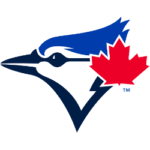
The Toronto Blue Jays have a new primary logo for 2020, but for fans of the classic Jays logo, you don’t have to worry about a massive redesign like in logo changes’ past.

Toronto Blue Jays Primary Logo 2020 - Present
The Jays are keeping the profile of the blue jay head and Maple Leaf and ditching the other elements of the primary logo that have been used since 2012 – and essentially for the first 20 years of the franchise’s existence. Gone are the baseball background, the scripting of TORONTO above the logo and BLUE JAYS below the logo, and the blue double-outline circle. The logo used for the last eight seasons will now become an alternate logo for the team.
It’s a much more subtle change than prior rebrandings. In 1997, the original logo was modernized by creating a sleeker blue jay head and baseball along with making the Maple Leaf a much more prominent part of the logo.

Toronto Blue Jays Primary Logo 2003
Toronto Blue Jays Primary Logo 2003[/caption] For 2003 only, the primary logo was a red and blue T that was being held by a muscular blue jay (adorned with a Maple Leaf tattoo on his bicep) carrying a baseball bat and tossing a baseball.
A massive redesign followed in 2004, as red was ditched as a primary color in favor of silver and graphite. The bird head was on the left side of the logo, with the word “Jays” in script to the right of it. It was known as the “Angry Jay.”

Toronto Blue Jays Alternate Logo 2004 - 2011
That logo lasted seven years, but fans were constantly telling the franchise that they wanted the original colors back, and even ex-team President Paul Beeston and former General Manager Alex Anthopoulos said after the logo unveiling in late 2011 that neither were a fan of the mostly shades-of-gray Jays logo era. There was an alternate black jersey that was especially despised. Fans not only enjoyed the return of the team’s original colors, but the Maple Leaf was back in the logo too, which was especially important since the Jays are now Major League Baseball’s only Canadian team.
That logo brought forth a retro logo era in MLB, as Houston Astros, Baltimore Orioles, Milwaukee Brewers, and San Diego Padres have been among clubs that have gone back to a logo that they used previously.
The Jays also turned back the clock on the field. While Toronto won two World Series titles and five American League East division crowns from 1985-93, they didn’t win a darn thing with any of the different logos from 1997-2011. After returning to the mostly original Blue Jays look, however, the Jays started winning again, reaching the American League Championship Series in 2015 and ’16.
The Jays are counting on a young core of hitters to help bring them back to the playoffs, including second-generation players Vladimir Guerrero Jr., Bo Bichette and Cavan Biggio.
See the Toronto Blue Jays logo history and Team History.
___
Sports Logo History is a vibrant community of sports logo enthusiasts who share a deep appreciation for the captivating histories behind each team's logo. We take pleasure in exploring the evolution of primary logos, alternate logos, and wordmark logos from renowned leagues such as the NFL, NBA, MLB, MLS, NHL, Premier League, WNBA, CFL, NCAA, UFL, ABA, USFL, AAF, and XFL. Immerse yourself in the intricate details and stories behind these iconic symbols that represent the essence of each team.
In the enthralling realm of sports, the battle of logos among different leagues unfolds as a captivating and ongoing spectacle. Step into the world of Sports Logo History, where we showcase the relentless pursuit of distinction by leagues such as the NFL, NBA, MLB, Premier League, and countless others. Witness the captivating journey as each league strives to create logos that not only capture the essence of their sport but also resonate deeply with fans.
Immerse yourself in the comprehensive sports history provided by Sports Team History, our esteemed partner site, where you can discover the triumphs, challenges, and defining moments that have shaped the legacies of professional sports teams. Stay up to date with the latest sports news through Sports News History, a platform delivering 24/7 coverage of highlights, player interviews, and game analyses. Additionally, express your unwavering support for your favorite teams by exploring Sports Store History, the premier sports team marketplace offering a vast selection of jerseys, memorabilia, and collectibles. Join our community today and celebrate the rich history, iconic logos, and passion of sports.

