Leeds United is one of English football's most historic and successful clubs. They are former winners of the top-flight division and FA Cup, and the team has also enjoyed some success in European competition.
Because of this, they are a massive draw for sponsors and other commercial partners. The list of major brands to be associated with Leeds includes Adidas, JD Sports, and Boost Drinks.
The Story Behind the Redesign
As Leeds approached their centenary year in 2019, the club proposed a radical redesign of their logo, which had already changed many times. It was reported a year earlier that a new crest had been in the pipeline and that it was to be inspired by the Leeds song ‘Marching on Together.’
 Sports Logo History
It was felt that the existing badge had negative connotations, as it was associated with a largely unsuccessful period in the team’s history. It was time to move on, and Leeds entered a six-month consultation process.
During this time, some 10,000 people helped with the discussions. Former players, fans, staff, local community members, and Leeds United’s owner were all involved in the process. At the end of the six-month consultation period, the result was revealed.
The Result
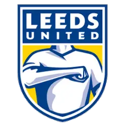
The proposed new crest featured Leeds’ classic white, yellow, and blue colors. The name ‘Leeds United’ was prominently displayed at the top of the badge. The central part of the crest featured a player's torso with their right arm across their chest.
At the bottom of the badge, the phrase " Celebrating fans" appeared at the heart of our identity. Finally, the logo signed off with #MOT - a famous hashtag fans use across social media, which stands for Marching on Together.
The crest was complete, but how would the club’s supporters receive it?
The Reaction
Just a few days after the release of the proposed badge, Leeds United released an update to their initial announcement. They said they would reopen consultation following ‘widespread criticism’ from the club’s fans.
While 10,000 people had been involved in the first consultation, it appeared that Leeds had not extended matters to the wider fanbase.
The backlash was best underlined by a petition against the new logo. Leeds United supporter Steven Barrett organized it, and within a few hours of the crest’s unveiling, no fewer than 50,000 people had signed it.
There seemed to be two main concerns over the new design. Firstly, the proposed badge bore more than a passing resemblance to the logo used by Gaviscon, a famous producer of medicines to tackle heartburn and indigestion.
More worrying was the link between the design and examples of far-right-wing imagery. As a combination, it wasn’t a great look for the club. Local MP Richard Burton was another to voice his concerns, stating that the new badge ‘filled him with horror.’
This resulted in scenes similar to that of a poker game online, the fans knew they had the most substantial hand, and the club was likely to give in and fold due to the pressure. And within a few hours, the club quickly released a statement confirming they would look again at their plans. While the badge was produced with good intentions, the criticism was so widespread and severe that it was clear that the crest would never be implemented.
No Shame in Backtracking
Leeds United’s plans to introduce their new badge in 2019 met with disaster, but the club eventually showed that it was prepared to listen to their supporters. Shortly after the plans were shelved, Leeds implemented a new crest featuring subtle changes to their existing design.
There was no shame in Leeds going back on their controversial crest. The mistake was not to involve the broader fanbase in the first place, but this was quickly rectified. Unfortunately, the club would suffer relegation at the end of the 2022/23 English domestic season. Still, a previous spell in the Premier League suggests they continue moving in the right direction.
Sports Logo History is a vibrant community of sports logo enthusiasts who share a deep appreciation for the captivating histories behind each team's logo. We take pleasure in exploring the evolution of primary logos, alternate logos, and wordmark logos from renowned leagues such as the NFL, NBA, MLB, MLS, NHL, Premier League, WNBA, CFL, NCAA, ABA, USFL, AAF, and XFL. Immerse yourself in the intricate details and stories behind these iconic symbols that represent the essence of each team.
In the enthralling realm of sports, the battle of logos among different leagues unfolds as a captivating and ongoing spectacle. Step into the world of Sports Logo History, where we showcase the relentless pursuit of distinction by leagues such as the NFL, NBA, MLB, Premier League, and countless others. Witness the captivating journey as each league strives to create logos that capture the essence of their sport and resonate deeply with fans.
Immerse yourself in the comprehensive sports history provided by Sports Team History, our esteemed partner site, where you can discover the triumphs, challenges, and defining moments that have shaped the legacies of professional sports teams. Stay up to date with the latest sports news through Sports News History, a platform delivering 24/7 coverage of highlights, player interviews, and game analyses. Additionally, express your unwavering support for your favorite teams by exploring Sports Market History, the premier sports team marketplace offering a vast selection of jerseys, memorabilia, and collectibles. Join our community today and celebrate the rich history, iconic logos, and passion of sports.

