The Stamford Bridge Tale - Chelsea’s Brief History

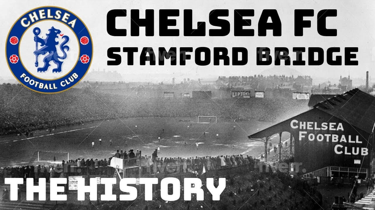
England is the birthplace of football, and the CasinoGap website, which focuses on GamStop customers, admits it. It is also the region where the primary outlandish stories of this beautiful sport were born, and among these is that of what we know today as the Blue Lions of Stamford Bridge, Chelsea Football Club. Chelsea is one of the most prominent British football clubs, which was founded on 10 March 1905 at The Rising Sun Pub (now The Butcher's Hook) in Fulham Road by Henry "Gus" & Joseph Mears (The two most notable businessmen at that time). Chelsea FC is one of the most auspicious representatives of English Football and has spent most of its playing time in the top English Premier League.
The Blues had their first significant achievement in 1955 when they won the league championship. They then won various cup competitions between 1965 and 1996. The club's most significant period of prosperity has occurred over the last two decades, during which it has won 21 trophies since 1997. Chelsea has won five English league titles, seven FA Cups, five League Cups, four FA Community Shields, one UEFA Champions League, two UEFA Cup Winners' Cups, one UEFA Europa League, and one UEFA Super Cup. Chelsea is the only London club to win the UEFA Champions League, and one of four clubs, and the only British club, to have won all three main UEFA club competitions.
Logo Evolution - Chelsea’s Crest
Chelsea's crest or logo has been changed approximately 11 times during the club's existence, with the first Chelsea crest being used for almost 50 years, from 1905 to 1952.
The first Chelsea FC crest was introduced when the club was established in 1905. Although the club didn't use the logo on their shirts, their crest began to appear on match-day programs.
The first Chelsea logo featured one of the famous "Chelsea Pensioners". The man portrayed in the logo is a veteran of the "Seven Years War" between England and France who wears a jacket with 4 medals of honor and the initials "CH" on the hat. The logo is inspired by one of Chelsea's symbols, the Royal Hospital Chelsea. Chelsea's first nickname also derives from "pensioner", the pensioners. There is a double version of the company's first crest: the simplest features blue on a white background, while the second is more elaborate, incorporating the name of the club in full. It will last almost 50 years before the aesthetic revolution of 1952.

Chelsea FC Primary Logo 1952 - 1953
The 1952-53 season will be remembered as Chelsea's first crest revolution. Ted Drake, one of the best footballers of the 1930s, becomes the club's general manager, and his first operation is a drastic rebranding. The "Chelsea pensioner" is retiring again, superseded by a coat of arms consisting of the initials "C.F.C" on a blue background. It only lasts for a year and never appears on the shirt, exactly like the former logos.

Chelsea FC Primary Logo 1953 - 1986
In 1953, the Chelsea logo began a new life, completely different from the previous two. From 1953 to 1986, the club crest featured an upright blue lion looking backward and holding a scepter, as if gazing over the team's shoulders. It was based on elements in the coat of arms of the Metropolitan Borough of Chelsea, with the “lion rampant regardant” taken from the arms of the then club president, Viscount Chelsea, and the staff from the Abbots of Westminster, former Lords of the Manor of Chelsea. It also featured three red roses, to represent England, and two footballs.
After 33 years, the corporate structure of the London team changes, and the ownership passes from Earl Cadogan to Ken Bates, one of the most controversial figures in the English football scene due to conflicting relationships with the fans. He bought the club despite Chelsea's enormous economic difficulties. The transition from Cadogan to Bates is also the transition from the rampant lion to the roaring lion. In fact, from 1986 to 2005, five chromatic versions of the logo alternated, all perfectly identical in style but with different shades and backgrounds. A peculiarity lies in the latest version of this crest.

Chelsea FC Primary Logo 2005 - 2006
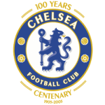
A new coat of arms in honor of the club’s 100th anniversary was created in 2004. Features a blue heraldic lion holding a scepter surrounded by a blue ring with two yellow, white-trimmed footballs and roses. The blue ring also includes the arched wordmark “CHELSEA” at the top and “FOOTBALL CLUB” at the bottom in white with yellow trim.

Chelsea FC Primary Logo 2006 - Present
This brings us to 2003-04, the year in which the era of Roman Abramovič begins, the Russian millionaire who for the centenary (2005) decides to comply with the requests of fans and re-establish the 1953 logo. Two years later, Chelsea changes face again, formalizing the transition to a stylized version of the rampant lion. The "restoration" has produced what we see today, a logo that is made up of 5 parts: the base, the blue circle, is the emblem of the Chelsea neighborhood; the lion once again recalls Stamford Bridge and Earl Cadogan; the walking stick, the symbol of the Abbot of Westminster; the roses and the footballs, symbols of England and the English Game; the sign that reads "The Chelsea Football Club".
The Chelsea logo features a combination of blue, white, yellow, and red colors – a palette that conveys energy, elegance, excellence, and perseverance.
See the Chelsea FC logo history and team history.
___
Sports Logo History is a vibrant community of sports logo enthusiasts who share a deep appreciation for the captivating histories behind each team's logo. We take pleasure in exploring the evolution of primary logos, alternate logos, and wordmark logos from renowned leagues such as the NFL, NBA, MLB, MLS, NHL, Premier League, WNBA, CFL, NCAA, UFL, ABA, USFL, AAF, and XFL. Immerse yourself in the intricate details and stories behind these iconic symbols that represent the essence of each team.
In the enthralling realm of sports, the battle of logos among different leagues unfolds as a captivating and ongoing spectacle. Step into the world of Sports Logo History, where we showcase the relentless pursuit of distinction by leagues such as the NFL, NBA, MLB, Premier League, and countless others. Witness the captivating journey as each league strives to create logos that not only capture the essence of their sport but also resonate deeply with fans.
Immerse yourself in the comprehensive sports history provided by Sports Team History, our esteemed partner site, where you can discover the triumphs, challenges, and defining moments that have shaped the legacies of professional sports teams. Stay up to date with the latest sports news through Sports News History, a platform delivering 24/7 coverage of highlights, player interviews, and game analyses. Additionally, express your unwavering support for your favorite teams by exploring Sports Store History, the premier sports team marketplace offering a vast selection of jerseys, memorabilia, and collectibles. Join our community today and celebrate the rich history, iconic logos, and passion of sports.
Top Football Designers Share Secrets of Chelsea FC's Logo Success
In this video, we examine the evolution of the Chelsea FC crest, highlighting how it has transformed alongside the club's growth and success. Each version of the logo tells a story, symbolizing key moments in Chelsea’s history and reflecting the club's values and achievements...

