The Detroit Tigers are one of baseball’s oldest teams. They are also one of the only original teams that have never changed their name or moved from their original city. This is partly why the team has so many devoted fans in the city, across Michigan, and around the country. Fans like to see a bit of loyalty from a team – it makes it feel like they care as much about the city as its inhabitants do.
Fans who are devoted to their team tend to enjoy placing bets on their success, even when the odds are against them. And the Tigers don’t always have the best odds. Three of the worst seasons in the team’s history of a century and a quarter have been in the last decade.
Recent changes to sports betting laws have made it possible to place bets in person at casinos or to bet online on your favorite team. Even when they lose, it’s a fun way to show how deep your loyalty goes. Betting the spread on a team like the Tigers is a smart way to protect at least part of your investment without having to sacrifice betting on your team.
While the team has stuck with one name and one location, it hasn’t been so attached to a single logo. This article will give a brief overview of the logos that the team has had. It will divide them into two groups – the tiger logos and the letter logos. Let’s get started!
The Tiger Years

Detroit Tigers Primary Logo 1957 - 1960
The Detroit Tigers have most frequently had a ‘D’ as their primary logo, but there have been several years in their history when the logo featured a tiger. The first appearance of the tiger was in 1901, when the team was a charter member of the American League, one of the two leagues that makes up the MLB. This initial logo was a red tiger.
The first tiger face logo was introduced in 1927 and it is no surprise that it was gone by 1929. This tiger had white eyes with no pupils and was honestly pretty terrifying. Instead of being intimidating like later versions of the logo, it was creepy and unsettling. This scary tiger generated such a negative reaction that it wasn’t until 1957 that the animal was reintroduced to the logo.
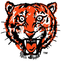
From 1957-2005, the Detroit Tigers had four logos that featured tigers. From 1957-60, it was simply a snarling tiger head. For the logo from 1961-63, a black circle was added around the tiger, with Detroit Tigers written on it. The longest lasting of the tiger logos was a slightly less aggressive-looking tiger, still inside a labeled circle. The black in earlier versions was replaced with a dark blue. This logo lasted from 1964-1993.
The logo from 1994-2005 was a dramatic shift. It brought back the Old English-style ‘D’ with a roaring tiger entwined with the letter. This was the most dynamic of the tiger logos and it’s easy to understand why it has remained the team’s alternate logo since it was replaced as the primary.
The Letter Logos
Of the 18 logos that the Detroit Tigers have had in the 120 years they’ve been a team, the majority of them have been a simple letter ‘D’. Since the team’s uniforms have remained basically the same – a white jersey with navy blue piping, white pants and a navy blue hat – the logos have all followed this color scheme. Where they have differed is in what style of lettering is used.
In 1904, the logo that we see today began to take shape. It was a letter ‘D’ in a style known as Old English. It resembles the classic lettering that people associate with Shakespeare, illuminated manuscripts, and shops with “Ye Olde” in the name. This first ‘D’ logo was in black.

Detroit Tigers Primary Logo 1914 - 1915
The primary change to the logo from 1905-07 was the color. Instead of black, it was navy blue to match the piping on the uniforms. The ‘D’s that was the logo from 1908-1913 and the one from 1914-15 were again very similar, with only minor changes. These included adding extra flourishes and making the lines thicker.
Since then, there have been a few years where the team switched from an Old English-style logo to a more simplified block letter ‘D’. These simpler versions have all been very short-lived, never lasting more than two seasons.
In 2016, the current logo was created. It is a return to the classic Old English ‘D’ of the team’s early years. It’s a classic and classy logo that keeps things simple without being boring.
_____
Sports Logo History is a community of sports logo enthusiast who enjoys the history of each team’s logo history. Sports Logo History has primary logos, alternate logos, or wordmark logos from the NFL, NBA, MLB, MLS, NHL, Premier League, WNBA, CFL, NCAA, ABA, USFL, AAF, and XFL.
Our partner site is Sports Team History takes a look at the history of each and every professional sports team. In addition, we have added Sports News History to our sports history websites. 24/7 non-stop sports news that's worth knowing. Finally, the premier sports team marketplace for your favorite team or college with thousands of items for you to peruse at Sports Market History.
The Detroit Tigers are one of baseball’s oldest teams. They are also one of the only original teams that have never changed their name or moved from their original city. This is partly why the team has so many devoted fans in the city, across Michigan, and around the country. Fans like to see a bit of loyalty from a team – it makes it feel like they care as much about the city as its inhabitants do.
Fans who are devoted to their team tend to enjoy placing bets on their success, even when the odds are against them. And the Tigers don’t always have the best odds. Three of the worst seasons in the team’s history of a century and a quarter have been in the last decade.
Recent changes to sports betting laws have made it possible to place bets in person at casinos or to bet online on your favorite team. Even when they lose, it’s a fun way to show how deep your loyalty goes. Betting the spread on a team like the Tigers is a smart way to protect at least part of your investment without having to sacrifice betting on your team.
While the team has stuck with one name and one location, it hasn’t been so attached to a single logo. This article will give a brief overview of the logos that the team has had. It will divide them into two groups – the tiger logos and the letter logos. Let’s get started!
The Tiger Years

Detroit Tigers Primary Logo 1957 - 1960
The Detroit Tigers have most frequently had a ‘D’ as their primary logo, but there have been several years in their history when the logo featured a tiger. The first appearance of the tiger was in 1901, when the team was a charter member of the American League, one of the two leagues that makes up the MLB. This initial logo was a red tiger.
The first tiger face logo was introduced in 1927 and it is no surprise that it was gone by 1929. This tiger had white eyes with no pupils and was honestly pretty terrifying. Instead of being intimidating like later versions of the logo, it was creepy and unsettling. This scary tiger generated such a negative reaction that it wasn’t until 1957 that the animal was reintroduced to the logo.
From 1957-2005, the Detroit Tigers had four logos that featured tigers. From 1957-60, it was simply a snarling tiger head. For the logo from 1961-63, a black circle was added around the tiger, with Detroit Tigers written on it. The longest lasting of the tiger logos was a slightly less aggressive-looking tiger, still inside a labeled circle. The black in earlier versions was replaced with a dark blue. This logo lasted from 1964-1993.
The logo from 1994-2005 was a dramatic shift. It brought back the Old English-style ‘D’ with a roaring tiger entwined with the letter. This was the most dynamic of the tiger logos and it’s easy to understand why it has remained the team’s alternate logo since it was replaced as the primary.
The Letter Logos
Of the 18 logos that the Detroit Tigers have had in the 120 years they’ve been a team, the majority of them have been a simple letter ‘D’. Since the team’s uniforms have remained basically the same – a white jersey with navy blue piping, white pants and a navy blue hat – the logos have all followed this color scheme. Where they have differed is in what style of lettering is used.
In 1904, the logo that we see today began to take shape. It was a letter ‘D’ in a style known as Old English. It resembles the classic lettering that people associate with Shakespeare, illuminated manuscripts, and shops with “Ye Olde” in the name. This first ‘D’ logo was in black.

Detroit Tigers Primary Logo 1914 - 1915
The primary change to the logo from 1905-07 was the color. Instead of black, it was navy blue to match the piping on the uniforms. The ‘D’s that was the logo from 1908-1913 and the one from 1914-15 were again very similar, with only minor changes. These included adding extra flourishes and making the lines thicker.
Since then, there have been a few years where the team switched from an Old English-style logo to a more simplified block letter ‘D’. These simpler versions have all been very short-lived, never lasting more than two seasons.
In 2016, the current logo was created. It is a return to the classic Old English ‘D’ of the team’s early years. It’s a classic and classy logo that keeps things simple without being boring.
___
Sports Logo History is a vibrant community of sports logo enthusiasts who share a deep appreciation for the captivating histories behind each team's logo. We take pleasure in exploring the evolution of primary logos, alternate logos, and wordmark logos from renowned leagues such as the NFL, NBA, MLB, MLS, NHL, Premier League, WNBA, CFL, NCAA, UFL, ABA, USFL, AAF, and XFL. Immerse yourself in the intricate details and stories behind these iconic symbols that represent the essence of each team.
In the enthralling realm of sports, the battle of logos among different leagues unfolds as a captivating and ongoing spectacle. Step into the world of Sports Logo History, where we showcase the relentless pursuit of distinction by leagues such as the NFL, NBA, MLB, Premier League, and countless others. Witness the captivating journey as each league strives to create logos that not only capture the essence of their sport but also resonate deeply with fans.
Immerse yourself in the comprehensive sports history provided by Sports Team History, our esteemed partner site, where you can discover the triumphs, challenges, and defining moments that have shaped the legacies of professional sports teams. Stay up to date with the latest sports news through Sports News History, a platform delivering 24/7 coverage of highlights, player interviews, and game analyses. Additionally, express your unwavering support for your favorite teams by exploring Sports Store History, the premier sports team marketplace offering a vast selection of jerseys, memorabilia, and collectibles. Join our community today and celebrate the rich history, iconic logos, and passion of sports.

