There was a period in which all of MLB’s teams were located within the continental United States. That would all change in 1969 when the Montreal Expos became established as an MLB franchise. The stage was set for the league’s eventual move to Montreal when a minor league team known as the AAA Montreal Royals folded in 1960. Politicians in Montreal began lobbying heavily for an MLB team to be established in the city. Their chances of getting a team were as good as someone Googling My Betting Sites Canada. Their wish would be granted nine years later.
“Montreal Expos” was derived from the Expo 67 World Fair. The Montreal Expos would spend their first eight years in a stadium known as Jarry Park Stadium before moving to Olympic Stadium for the duration of the franchise’s tenure in Montreal.
There have been many legendary players who have donned the Montreal Expos uniform. Some of those players include Gary Carter, Andre Dawson, Vladimir Guerrero, Randy Johnson, and Larry Walker.
The Montreal Expos franchise folded in 2004 and relocated to Washington, D.C., to become the Washington Nationals. In this piece, we will review the logo history of the Montreal Expos.

Montreal Expos Primary Logo 1969 - 1991
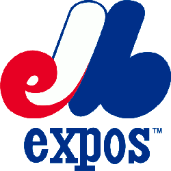
The Montreal Expos have had two primary logos throughout their franchise history. Their first logo was in 1969 and wouldn’t be altered until 1991. The top of the logo was a series of interwoven script pieces forming an “eMb” wordmark. The word eMb stands for “Expos De Montreal Baseball. The eMb was multi-colored. The eMb was designed to resemble a large “M.” The red color was positioned on the far left of the logo. The white would end up mixing in with the red on the left half of the logo. One can see that the white half of the logo has a blue trim.
The entire right side of the logo was colored dark blue and contained no dark trim. The bottom line of this logo has a lowercase “expos” wordmark. It is the same shade of blue as the right side of the logo.
In 1992, the Montreal Expos altered its primary logo. However, the same red, white, and blue eMb logo from the previous logo was also included in this logo. This logo was now positioned in the center of a circular design. The circular logo features colors of red, white, and blue. The top half of the logo is colored red and has a white “MONTREAL” wordmark. The lower half of the logo is dark blue and has a white “EXPOS” wordmark. Both sides of the circular logo feature red, white, and blue stripes that serve as a midpoint between the top and bottom halves of the logo. The logo's lower and upper halves can be seen as semicircles.
The highlight of this logo is the white baseball positioned at the center of the circular design. The white baseball has red seams. The red, white, and eMb logo, derived from the previous logo, is contained within the white baseball.
___
Sports Logo History is a vibrant community of sports logo enthusiasts who share a deep appreciation for the captivating histories behind each team's logo. We take pleasure in exploring the evolution of primary logos, alternate logos, and wordmark logos from renowned leagues such as the NFL, NBA, MLB, MLS, NHL, Premier League, WNBA, CFL, NCAA, UFL, ABA, USFL, AAF, and XFL. Immerse yourself in the intricate details and stories behind these iconic symbols that represent the essence of each team.
In the enthralling realm of sports, the battle of logos among different leagues unfolds as a captivating and ongoing spectacle. Step into the world of Sports Logo History, where we showcase the relentless pursuit of distinction by leagues such as the NFL, NBA, MLB, Premier League, and countless others. Witness the captivating journey as each league strives to create logos that not only capture the essence of their sport but also resonate deeply with fans.
Immerse yourself in the comprehensive sports history provided by Sports Team History, our esteemed partner site, where you can discover the triumphs, challenges, and defining moments that have shaped the legacies of professional sports teams. Stay up to date with the latest sports news through Sports News History, a platform delivering 24/7 coverage of highlights, player interviews, and game analyses. Additionally, express your unwavering support for your favorite teams by exploring Sports Store History, the premier sports team marketplace offering a vast selection of jerseys, memorabilia, and collectibles. Join our community today and celebrate the rich history, iconic logos, and passion of sports.

