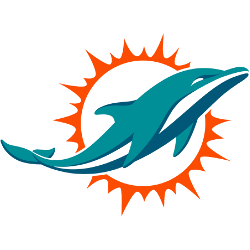
Since the Miami Dolphins’ inception in 1966, their logo has undergone several transformations, each reflecting shifts in design trends and the franchise’s evolving identity. This article examines the history and evolution of the Dolphins’ logo, highlighting the significance of each version. 1966–1973: The Original Emblem The original Miami Dolphins logo showcased a turquoise dolphin mid-leap, sporting a white helmet with …
Miami Dolphins Wordmark Logo
Miami Dolphins 2018 – Present An aqua and marine-blue dolphin swimming in front of a coral sunburst. A new shade of coral orange. Dolphins Alternate LogoDolphins Primary LogoDolphins Team HistoryDolphins Team MerchDolphins Wordmark Logo The Miami Dolphins wordmark logo is one of the most iconic logos in all of the professional sports. It has been around since 1966, when it …
Miami Dolphins Alternate Logo
Miami Dolphins 2018 – Present An aqua and marine-blue dolphin swimming in front of a coral sunburst. A new shade of coral orange. Dolphins Primary LogoDolphins Wordmark LogoDolphins Team HistoryDolphins Team MerchDolphins Alternate Logo The Miami Dolphins have had an alternate logo since the team’s inception in 1966. The original logo was a simple white and aqua dolphin head with …
Miami Dolphins Primary Logo
Miami Dolphins 2018 – Present An aqua and marine-blue dolphin swimming in front of a coral sunburst. A new shade of coral orange. Dolphins Alternate LogoDolphins Wordmark LogoDolphins Team HistoryDolphins Team MerchDolphins Primary Logo The Miami Dolphins’ primary logo has gone through a few changes over the years. The original logo was designed in 1966 when the team first joined …


