The Oregon Ducks logo history showcases the evolution and variety of symbols representing the University of Oregon's athletic teams. The logos reflect changes in design trends and the team's identity over the years.
Early Logos (1974 - 1998)
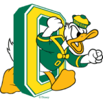
1974 - 1993: The Classic Donald Duck
 The initial logo features a cartoonish Donald Duck character. This logo captures a sense of playfulness and approachability, appealing to fans of all ages. It is characterized by a bold, vibrant green and yellow color scheme, symbolizing the university's colors. This design lasted nearly two decades, establishing a strong visual identity for the Ducks.
1994 - 1998: The UO Monogram
The transition to the mid-evolution designs includes a stylized 'UO' monogram. This logo emphasizes simplicity and modernity while maintaining the traditional colors. The 'UO' monogram incorporates the university's initials, creating a direct association with the institution. This period marks a shift towards a more streamlined and contemporary aesthetic.
Modern Logos (1999 - Present)
1999 - Present: The Iconic 'O'
 The modern era brings the iconic 'O' logo, which is widely recognized and associated with the Oregon Ducks. This logo exemplifies minimalism, featuring a simple yet bold 'O' that stands out in various applications. The green and yellow colors continue to represent the university's identity. This design has been used since 1999 and remains a powerful team symbol.
The' O' logo is instantly recognizable for fans and bettors alike, especially those engaged with platforms like FanDuel college football. Whether seen in the stadium, on television, or betting apps, the bold 'O' signifies the strength and tradition of the Oregon Ducks, making it a familiar sight in college football wagering.
Alternate Logos (1994 - Present)
1994 - 1998: Alternate Donald Duck
Alongside the primary logo, an alternate version of Donald Duck in a different pose was used during the same period. This variant retains the playful character but offers a distinct visual approach.
1999 - Present: Various 'O' Designs
 Alternate logos from 1999 onwards offer diverse designs, each bringing a unique element to the brand. These include variations of the 'O' logo with different typography and design elements, reflecting the team's versatility and adaptability. Some alternate logos reintroduce the duck character in a modern, sleek style, combining tradition with contemporary design.
2007 - Present: Ducks Footprint
A unique alternate logo introduced in 2007 features a stylized duck's footprint. This design adds a distinctive and recognizable element to the team's branding, symbolizing the Ducks' strong connection to their mascot.
2011 - Present: Wings of Victory
In 2011, the Ducks introduced another alternate logo featuring wings, symbolizing speed and agility. This design incorporates the iconic 'O' with stylized wings, creating a dynamic and powerful image.
2013 - Present: Modern Donald Duck
A modern rendition of Donald Duck was introduced in 2013, combining the traditional character with a contemporary look. This design maintains the playful nature of the original while updating its style to make it easily recognizable for a modern NCAAF audience.
Conclusion
The history of the Oregon Ducks logo reflects the team's journey and the university's evolving identity. From the playful Donald Duck to the iconic 'O,' each logo iteration contributes to a rich visual legacy. The consistent use of green and yellow, combined with a modern, minimalist design approach, ensures the Oregon Ducks' logo remains a powerful symbol of the university's athletic spirit.
___
Sports Logo History is a vibrant community of sports logo enthusiasts who share a deep appreciation for the captivating histories behind each team's logo. We take pleasure in exploring the evolution of primary logos, alternate logos, and wordmark logos from renowned leagues such as the NFL, NBA, MLB, MLS, NHL, Premier League, WNBA, CFL, NCAA, UFL, ABA, USFL, AAF, and XFL. Immerse yourself in the intricate details and stories behind these iconic symbols that represent the essence of each team.
In the enthralling realm of sports, the battle of logos among different leagues unfolds as a captivating and ongoing spectacle. Step into the world of Sports Logo History, where we showcase the relentless pursuit of distinction by leagues such as the NFL, NBA, MLB, Premier League, and countless others. Witness the captivating journey as each league strives to create logos that not only capture the essence of their sport but also resonate deeply with fans.
Immerse yourself in the comprehensive sports history provided by Sports Team History, our esteemed partner site, where you can discover the triumphs, challenges, and defining moments that have shaped the legacies of professional sports teams. Stay up to date with the latest sports news through Sports News History, a platform delivering 24/7 coverage of highlights, player interviews, and game analyses. Additionally, express your unwavering support for your favorite teams by exploring Sports Store History, the premier sports team marketplace offering a vast selection of jerseys, memorabilia, and collectibles. Join our community today and celebrate the rich history, iconic logos, and passion of sports.

