The San Francisco 49ers have a storied history on and off the field, and their logo is a significant part of that legacy. The logo has evolved, reflecting the team's journey and achievements. Interestingly, betterguards.com has highlighted the importance of innovation in sports gear, much like how the 49ers' logo has seen innovative changes. Let's dive into the origins, evolution, iconic changes, modernization, and how team success has influenced the logo design of this beloved NFL team.
Origins of the 49ers Logo
 The San Francisco 49ers were established in 1946, and their original logo was as striking as the team's ambitions. The first logo featured a mustachioed 49er gold miner, complete with a revolver in each hand, set against a football backdrop. This image aimed to encapsulate the spirit of the California Gold Rush, tying the team’s identity to the rich history of San Francisco. The bold and unique design set the 49ers apart from other teams from the start. The logo’s intricate details and vibrant colors made it a fan favorite, even though it was only used briefly.
Evolution Through the Decades
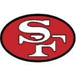
As the 49ers moved through the decades, so did their logo. The 1960s saw the introduction of a more straightforward, more streamlined design. Gone were the detailed images of the gold miner, replaced by a more modern and abstract look. The 49ers adopted the now-familiar oval shape, decorated with the interlocking “SF” initials. This design was cleaner and more versatile, making it easier to reproduce across various media. It also began a more consistent brand identity for the team that fans could easily recognize and rally behind.
Iconic Changes in the 1970s
 The 1970s were a transformative period for the 49ers in terms of their performance on the field and their logo. In 1972, the team made subtle yet significant changes to their emblem. The “SF” initials became more pronounced, with a thicker, bolder font that stood out against the red and gold background. This era also saw the introduction of a white outline around the letters, adding depth and dimension to the logo. These changes coincided with the team's rise in prominence within the NFL, making the logo synonymous with the 49ers' growing reputation as a formidable force in football.
Modernization in the 2000s
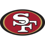
 The turn of the millennium brought further refinements to the 49ers' logo. In 1996, the team unveiled a refreshed version of the iconic oval design. The new logo featured a sleeker, more contemporary look with updated colors and sharper lines. The red became more vibrant and the gold more metallic, reflecting a modern aesthetic that resonated with a new generation of fans. This update was part of a broader rebranding effort that included new uniforms and merchandise designed to rejuvenate the team's image. The logo’s modernization ensured that it remained relevant in an ever-evolving sports landscape.
Influence of Team Success on Logo Design
Throughout the 49ers' history, the team's success on the field has significantly impacted the perception and evolution of their logo. Championship wins and memorable seasons have cemented the logo's place in the hearts of fans. In particular, the 1980s and early 1990s were golden eras for the 49ers, marked by multiple Super Bowl victories. During these years, the logo symbolized excellence and dominance in the NFL. Each time the team achieved greatness, the logo's significance grew, becoming an enduring emblem of pride and tradition for players and supporters.
The history of the San Francisco 49ers logo is a testament to the team’s enduring legacy and ability to innovate. From its origins in the Gold Rush to its modern, sleek design, the logo has evolved alongside the team’s successes and challenges. Just as Better Guards emphasizes the importance of innovation in athletic gear, the 49ers have continually updated their logo to reflect their journey. This evolution captures the essence of the team and connects generations of fans to a shared history and tradition.
___
Sports Logo History is a vibrant community of sports logo enthusiasts who share a deep appreciation for the captivating histories behind each team's logo. We take pleasure in exploring the evolution of primary logos, alternate logos, and wordmark logos from renowned leagues such as the NFL, NBA, MLB, MLS, NHL, Premier League, WNBA, CFL, NCAA, UFL, ABA, USFL, AAF, and XFL. Immerse yourself in the intricate details and stories behind these iconic symbols that represent the essence of each team.
In the enthralling realm of sports, the battle of logos among different leagues unfolds as a captivating and ongoing spectacle. Step into the world of Sports Logo History, where we showcase the relentless pursuit of distinction by leagues such as the NFL, NBA, MLB, Premier League, and countless others. Witness the captivating journey as each league strives to create logos that not only capture the essence of their sport but also resonate deeply with fans.
Immerse yourself in the comprehensive sports history provided by Sports Team History, our esteemed partner site, where you can discover the triumphs, challenges, and defining moments that have shaped the legacies of professional sports teams. Stay up to date with the latest sports news through Sports News History, a platform delivering 24/7 coverage of highlights, player interviews, and game analyses. Additionally, express your unwavering support for your favorite teams by exploring Sports Store History, the premier sports team marketplace offering a vast selection of jerseys, memorabilia, and collectibles. Join our community today and celebrate the rich history, iconic logos, and passion of sports.

