The Baltimore Ravens logo is more than just a symbol on a helmet; it represents the team's resilience, history, and cultural significance. Since its inception in 1996, following the city's heartache over losing the Colts to its current form, the Ravens logo has undergone considerable changes, capturing the spirit of Baltimore and the team's identity. Let's deeply dive into how this emblem has transformed over the decades.
The Birth of the Baltimore Ravens
The Baltimore Ravens began in 1996, marking a new chapter for Baltimore's football fans after the Colts moved to Indianapolis in 1984. The city gained a franchise when Art Modell moved the Cleveland Browns to Baltimore following the 1995 season, citing financial challenges. The Ravens wiped out all the Browns records linked with the franchise and returned them to Cleveland when the Browns were awarded a new franchise in 1999.
The team’s name, chosen through a poll by the Baltimore Sun, was inspired by Edgar Allan Poe’s famous poem “The Raven.” This name connected with local culture and added a layer of mystique and literary depth to the team's identity.
The Original Logo (1996 - 1998)
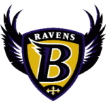 The Baltimore Ravens' first logo was introduced in 1996. It depicted a traditional crest with some unique details and a vibrant color palette. The shield was bright yellow with a stylized purple "B" outlined in white. This bold letter had a black and purple frame with two sharp, elegant wings curving out from its sides. The word "Ravens" was placed along the upper bar of the crest, perfectly balancing the overall design.
There were also additional logos during this period, including a segmented crest and a sharp, winged banner, all emphasizing strength and vigor. These designs were visually striking and established a foundation for the team's brand identity.
The Major Redesign (1999 - Today)
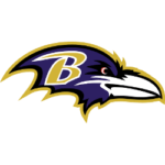 In 1999, the Ravens introduced a significant redesign that remains the core of their visual identity today. The current logo features an aggressive raven's profile facing right, with a bold yellow "B" superimposed on its head. This logo retains the original purple and yellow palette, softened slightly with white and black accents, lending it a modern and dynamic appearance.
The redesigned logo's sharp lines and elongated shapes convey a sense of motion and progress. It's a fitting emblem for a team that has achieved two Super Bowl victories in 2000 and 2012. This consistency in style and color reflects the team’s values and philosophy, and the logo has become an iconic symbol of the Ravens’ identity.
Elements of the Ravens Logo
Color Palette
- Purple (PMS 273 C): HEX #241773; symbolizes pride and nobility.
- Black (PMS BLACK 6 C): HEX #000000; denotes strength and authority.
- Metallic Gold (PMS 8660 C): HEX #9E7C0C; adds a regal touch, representing excellence and high standards.
Uniforms
The Ravens' uniforms complement their logo with three primary designs:
- Primary: Purple jerseys with white pants.
- Secondary: White jerseys with purple details and black pants.
- Alternate: All-black uniforms with purple stripes and white numbers.
Helmet Designs
Two main helmet designs exist:
- Glossy purple helmet: Features the raven’s head logo with a golden central stripe.
- Matte black helmet: A more severe look, retaining the signature purple and gold raven.
The Cultural Impact and Mascot
The cultural impact of the Ravens logo extends beyond mere aesthetics. The logo is a beacon for Baltimore’s resilience, especially after losing the Colts to Indianapolis. The team’s mascot, Poe the Raven, introduced in 1998, has become an integral part of the Ravens' identity. With its friendly yet fierce appearance, Poe embodies the team's spirit and provides a tangible connection to their literary inspiration.
Wrap Up
The Baltimore Ravens logo has evolved from its initial crest-like design to an aggressive and dynamic symbol, representing a sports team and the spirit of an entire city. Each element of the logo, from its bold colors to its stylized raven profile, tells a story of determination, success, and cultural significance.
Whether you're a fan checking the Ravens money line or an observer of the team’s journey, the logo stands as a testament to Baltimore football's enduring legacy.
___
Sports Logo History is a vibrant community of sports logo enthusiasts who share a deep appreciation for the captivating histories behind each team's logo. We take pleasure in exploring the evolution of primary logos, alternate logos, and wordmark logos from renowned leagues such as the NFL, NBA, MLB, MLS, NHL, Premier League, WNBA, CFL, NCAA, ABA, USFL, AAF, and XFL. Immerse yourself in the intricate details and stories behind these iconic symbols that represent the essence of each team.
In the enthralling realm of sports, the battle of logos among different leagues unfolds as a captivating and ongoing spectacle. Step into the world of Sports Logo History, where we showcase the relentless pursuit of distinction by leagues such as the NFL, NBA, MLB, Premier League, and countless others. Witness the captivating journey as each league strives to create logos that not only capture the essence of their sport but also resonate deeply with fans.
Immerse yourself in the comprehensive sports history provided by Sports Team History, our esteemed partner site, where you can discover the triumphs, challenges, and defining moments that have shaped the legacies of professional sports teams. Stay up to date with the latest sports news through Sports News History, a platform delivering 24/7 coverage of highlights, player interviews, and game analyses. Additionally, express your unwavering support for your favorite teams by exploring Sports Store History, the premier sports team marketplace offering a vast selection of jerseys, memorabilia, and collectibles. Join our community today and celebrate the rich history, iconic logos, and passion of sports.