The Premier League, a global football powerhouse, has seen its fair share of evolution. One of the most noticeable changes has been in the logos of several teams. Here are five Premier League teams that have undergone significant logo transformations.
1. Arsenal: From Cannon to Crest
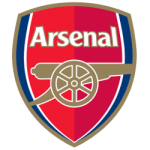
However, in 2002, Arsenal underwent a significant rebranding. The cannon was retained but was placed within a shield, and the club's name was added in a modern font. The new logo reflected Arsenal's status as a modern, global club.
The decision to update the logo was met with mixed reactions from fans. Some praised the new design, arguing that it was necessary to modernize the club's image. Others criticized the change, claiming it was a departure from the club's traditional values.
Despite the initial controversy, the new logo has since been widely accepted by Arsenal fans. It has become a recognizable club symbol worldwide and is often used on websites like sports betting websites with sports betting bonuses, merchandise, advertising, and the club's website.
2. Manchester United: The Devil's Pitchfork
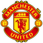
The 2012 logo features the iconic "devil's pitchfork," a symbol associated with the club since the 1950s. This emblem is said to represent the club's fighting spirit and determination. The logo also introduced a new color palette, featuring a darker shade of red and a contrasting gold. The word "United" was added in a bold, sans-serif font, further enhancing the logo's modern aesthetic.
Several factors drove the decision to redesign the Manchester United logo. The club sought to create a logo that would resonate with younger fans and appeal to a global audience. The new logo was also designed to complement the club's other branding elements, such as merchandise and marketing materials.
The 2012 logo change was met with mixed reactions from fans. Some praised the modern and sleek design, while others expressed nostalgia for the traditional red and white colors. Despite the initial controversy, the new logo has become widely accepted and is now a recognizable symbol of Manchester United.
The 2012 logo change was a significant milestone in Manchester United's history. By combining traditional elements with a modern aesthetic, the club created a logo that reflects its rich heritage while also looking toward the future.
3. Liverpool: The Liverbird
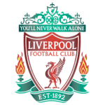
While the Liverbird has remained a constant symbol of Liverpool FC, the logo has undergone several changes. The most recent redesign occurred in 2012 when the club updated the logo to give it a more modern feel.
The updated logo featured a more prominent Liverbird, with its wings spread wider and its beak more pronounced. The club's name, "Liverpool Football Club," was added in a bold, sans-serif font below the Liverbird. The overall design was cleaner and more streamlined, reflecting the club's status as a global brand.
The Liverbird is a mythical creature said to have guarded the city of Liverpool since Roman times. It is often depicted as a bird with a human head. The Liverbird symbolizes the city's maritime heritage and a strong sense of community.
Liverpool FC's adoption of the Liverbird as its emblem was a natural choice, given the club's close ties to the city. The Liverbird has become a symbol of the club's history, achievements, and connection to the people of Liverpool.
4. Chelsea: The Lion and the Unicorn
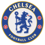
The lion and unicorn are often depicted as fighting each other, representing the conflict between England and Scotland. However, in Chelsea's logo, the lion and unicorn stand side by side, symbolizing unity and strength.
Chelsea Football Club first adopted the lion and unicorn in the early 20th century. The club's founder, Hugh Locke-Langton, was a wealthy businessman with close ties to the royal family. He chose the lion and unicorn to symbolize the club's prestige and association with the upper class.
Chelsea's logo underwent a significant redesign in 2008. The lion and unicorn were retained, but the overall design was modernized. The colors were updated to a more vibrant palette, and the club's name was added in a bold, sans-serif font.
The 2008 logo change was part of a broader rebranding effort by the club. Chelsea sought to establish itself as a global brand and appeal to a wider audience. The new logo was designed to be more contemporary and visually appealing.
Despite the changes, the lion and unicorn remain central to Chelsea's identity. The logo symbolizes the club's history, tradition, and connection to the royal family.
5. Tottenham Hotspur: The Cockerel
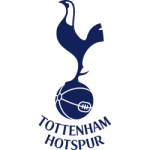
The cockerel's association with Tottenham Hotspur can be traced back to the club's early days. In the 19th century, the area around Tottenham was known for its poultry farming. The cockerel, a common sight in the local area, became a natural choice as a symbol for the club.
Tottenham Hotspur's cockerel logo has undergone several changes over the years. In the early days, the cockerel was depicted in a simple, cartoonish style. As the club grew in stature, the logo became more sophisticated.
The most recent redesign of the Tottenham Hotspur logo took place in 2006. The updated logo featured a more realistic depiction of the cockerel, with the bird standing proudly on its hind legs. The club's name, "Tottenham Hotspur," was added in a bold, sans-serif font below the cockerel.
The cockerel has become a symbol of Tottenham Hotspur's pride and determination. The bird is often associated with courage, vigilance, and leadership. For Tottenham fans, the cockerel represents the club's fighting spirit and commitment to excellence.
Wrap Up
The logos of Premier League teams have evolved significantly over the years, reflecting the changing nature of the sport and the clubs themselves. These iconic emblems have become synonymous with their respective clubs, from Arsenal's cannon to Manchester United's devil's pitchfork.
The decision to update logos is often driven by a desire to modernize the club's image, appeal to a broader audience, or strengthen its connection to its local community. While such changes can sometimes be met with controversy, they ultimately serve to keep the clubs relevant and engaging for fans of all ages. As the Premier League grows, we will likely see further logo changes.
___
Sports Logo History is a vibrant community of sports logo enthusiasts who share a deep appreciation for the captivating histories behind each team's logo. We take pleasure in exploring the evolution of primary logos, alternate logos, and wordmark logos from renowned leagues such as the NFL, NBA, MLB, MLS, NHL, Premier League, WNBA, CFL, NCAA, UFL, ABA, USFL, AAF, and XFL. Immerse yourself in the intricate details and stories behind these iconic symbols that represent the essence of each team.
In the enthralling realm of sports, the battle of logos among different leagues unfolds as a captivating and ongoing spectacle. Step into the world of Sports Logo History, where we showcase the relentless pursuit of distinction by leagues such as the NFL, NBA, MLB, Premier League, and countless others. Witness the captivating journey as each league strives to create logos that not only capture the essence of their sport but also resonate deeply with fans.
Immerse yourself in the comprehensive sports history provided by Sports Team History, our esteemed partner site, where you can discover the triumphs, challenges, and defining moments that have shaped the legacies of professional sports teams. Stay up to date with the latest sports news through Sports News History, a platform delivering 24/7 coverage of highlights, player interviews, and game analyses. Additionally, express your unwavering support for your favorite teams by exploring Sports Store History, the premier sports team marketplace offering a vast selection of jerseys, memorabilia, and collectibles. Join our community today and celebrate the rich history, iconic logos, and passion of sports.

