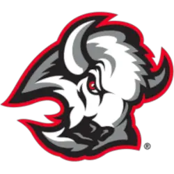
It appears that the Buffalo Sabres are headed back to their roots as far as their logo history is concerned. They are returning to the Goathead logo that the team represented in the 1990s.
This move comes as part of an effort by the Sabres organization to increase the interest level of their fanbase.
Next season, the Buffalo Sabres will wear their alternative jersey with the goathead logo represented. The Buffalo Sabres are scheduled to wear these alternative jerseys in 13 games during the season. The first game that this jersey will be worn will be on November 23rd, 2022, vs. the St Louis Blues. The Buffalo Sabres are planning to do this for the next three years.
In order to get the full context of this change in the direction of the Buffalo Sabres, we should look at the Buffalo Sabres logo history.

Buffalo Sabres Primary Logo 1997 - 1999
The Buffalo Sabres’ first primary logo lasted from 1970 to 1996. The Sabres’ first primary logo is a blue circle with a white buffalo in the middle. The buffalo is in the middle of two white sabres and appears to be charging forward. Both white sabres have handles that are colored yellow. A yellow outline can be seen just outside of the circular logo.
From 1997 to 1999, the first adoption of the Goathead logo came to fruition. It consisted of the head of a buffalo colored white, silver, and black. Additionally, the logo also had red trim. One can see that the buffalo in the logo is quite menacing.
From 2000 to 2006, there was a slight change to the Goathead logo. The shade of the aforementioned red trim in the logo was adjusted.
The Buffalo Sabres would go in a different direction with their primary logo in 2007. This logo would consist of a buffalo with a color scheme of navy blue and yellow. The buffalo appears to be advancing forward. The Buffalo Sabres would stick with this primary logo until 2010.
In 2011, the Buffalo Sabres would go back to their first ever aforementioned primary logo and have maintained mainly this primary logo ever since. Some slight modifications were made in 2021. For instance, we no longer see the ear of the white buffalo in the middle of the two white sabres.
 Sports Logo History
Thus, returning the goathead logo as an alternative logo would mark the 2nd time that the franchise has gone back to its roots as far as logo history is concerned.
There are some critical differences between the goathead buffalo logo worn by the team from 1996-2006 and the goathead buffalo logo worn in the upcoming season via the alternative jersey.
In the old logo, there was a brighter shade of red in the eyes of the buffalo. There was also a light silver outline across the buffalo logo. In the new goat head logo, the buffalo’s red eyes are darker. Also, there is no silver outline.
Sports Logo History is a vibrant community of sports logo enthusiasts who share a deep appreciation for the captivating histories behind each team's logo. We take pleasure in exploring the evolution of primary logos, alternate logos, and wordmark logos from renowned leagues such as the NFL, NBA, MLB, MLS, NHL, Premier League, WNBA, CFL, NCAA, UFL, ABA, USFL, AAF, and XFL. Immerse yourself in the intricate details and stories behind these iconic symbols that represent the essence of each team.
In the enthralling realm of sports, the battle of logos among different leagues unfolds as a captivating and ongoing spectacle. Step into the world of Sports Logo History, where we showcase the relentless pursuit of distinction by leagues such as the NFL, NBA, MLB, Premier League, and countless others. Witness the captivating journey as each league strives to create logos that not only capture the essence of their sport but also resonate deeply with fans.
___
Sports Logo History is a vibrant community of sports logo enthusiasts who share a deep appreciation for the captivating histories behind each team's logo. We take pleasure in exploring the evolution of primary logos, alternate logos, and wordmark logos from renowned leagues such as the NFL, NBA, MLB, MLS, NHL, Premier League, WNBA, CFL, NCAA, UFL, ABA, USFL, AAF, and XFL. Immerse yourself in the intricate details and stories behind these iconic symbols that represent the essence of each team.
In the enthralling realm of sports, the battle of logos among different leagues unfolds as a captivating and ongoing spectacle. Step into the world of Sports Logo History, where we showcase the relentless pursuit of distinction by leagues such as the NFL, NBA, MLB, Premier League, and countless others. Witness the captivating journey as each league strives to create logos that not only capture the essence of their sport but also resonate deeply with fans.
Immerse yourself in the comprehensive sports history provided by Sports Team History, our esteemed partner site, where you can discover the triumphs, challenges, and defining moments that have shaped the legacies of professional sports teams. Stay up to date with the latest sports news through Sports News History, a platform delivering 24/7 coverage of highlights, player interviews, and game analyses. Additionally, express your unwavering support for your favorite teams by exploring Sports Store History, the premier sports team marketplace offering a vast selection of jerseys, memorabilia, and collectibles. Join our community today and celebrate the rich history, iconic logos, and passion of sports.

