 Sports Logo History
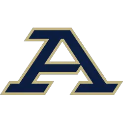
The new change in the athletic logo of the Akron Zips will lead to a team that will now be primarily represented by the first letter in the alphabet. This logo change will become the school’s primary brand for the foreseeable future. In recent years, the Zips’s athletic logo was represented by the last letter of the alphabet.
This logo change represents the city’s sixth logo change since 1995. Most of their new logos were substantial departures from their predecessors.
From 1995-2002, the Akron Zips had a bright bold yellow “A” wordmark. One can see that there is a blue outline surrounding the “A” wordmark. However, the biggest highlight comes from the blue backdrop that could be seen. The left side of the logo almost serves as a blue streak that served to give the logo life.
In 2002, Akron went in an entirely different direction with its logo. The main highlight of this logo was the kangaroo that was represented. The kangaroo has a color scheme of blue, white, and gold. The kangaroo was primarily covered with blue while the gold represented the outline. White can be seen in the kangaroo’s nose and neck. Additionally, the kangaroo was positioned like he was in the midst of hopping.
A white “AKRON” wordmark can be seen across the middle of the logo. Right below the white “AKRON” wordmark, a gold italicized “ZIPS” wordmark can be seen right underneath it. This logo lasted until 2008.
From 2008-2015, the Akron Zips would adopt a logo in which the main highlight was the head of the kangaroo. The kangaroo’s head was the same color scheme as its predecessor (white, gold, and blue). The kangaroo was partially obscuring a white “A” wordmark.
In 2015, the Akron Zips did a complete 180 degree and switched to a logo with a white “Z” wordmark. The “Z” wordmark had an outline that is both blue and gold. The logo lasted for six years.
 Sports Logo History
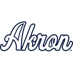
In 2021, Akron switched to a white scripted “AKRON” wordmark with a dark blue trim outline. However, this logo only lasted during the 2021-2022 season.
With their newest logo, the Akron Zips did a complete 180 from their predecessor. They went from a scripted word back to a wordmark with the letter “A”. The logo is colored blue and has an outline in gold trim.
It will be interesting to see the potential longevity of this logo and the institution’s new direction with regards to branding.
Sports Logo History is a community of sports logo enthusiast who enjoys the history of each team’s logo history. Sports Logo History has primary logos, alternate logos, or wordmark logos from the NFL, NBA, MLB, MLS, NHL, Premier League, WNBA, CFL, NCAA, ABA, USFL, AAF, and XFL.
Our partner site is Sports Team History takes a look at the history of each and every professional sports team. In addition, we have added Sports News History to our sports history websites. 24/7 non-stop sports news that's worth knowing. Finally, the premier sports team marketplace for your favorite team or college with thousands of items for you to peruse at Sports Market History.

