Few franchises have as much history as the Minnesota Twins. Founded in 1901, they were known by the Washington Nationals and the Washington Senators for the first 60 seasons of their existence. They officially became the Minnesota Twins in 1961. The franchise has 3 World Series and 6 pennants to its credit.
The Minnesota Twins announced they had undergone a logo change a few days ago. Usually, teams undergo logo changes to signal a new shift in direction and/or reinvigorate a franchise. The Twins have missed the playoffs the last two years, so reinvigoration is the order of the day for this current logo change.
 Sports Logo History
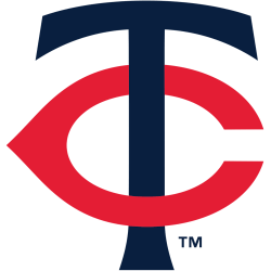
 It is no question that their new logo is a nod to the past. Long-time Minnesota Twins fans will immediately recognize this logo. Contained within a purple background, the logo includes a white “T” wordmark that is displayed prominently. However, the “T” is encircled by a bright red “C” wordmark. The bright red “C” logo is almost reminiscent of the Chicago Bears “C” wordmark. It even reminds me of the Cincinnati Reds “C” wordmark logo. The bright red “C” logo encircles the middle of the “T” wordmark. The end result is an interlocked “TC” logo. The “TC” wordmark represents the Twin Cities.
This logo format is a throwback to one of the franchise’s alternate logo formats that the Twins had for the latter part of the 20th century. Specifically, the franchise used this logo format between 1961 and 1986. There are some differences. One of them is that the “T” wordmark is dark blue instead of white. Also, the ends of the “T” wordmark drop down a little. The ends of the “T” in its newest logo are straighter.
The old logo also has a red “C” logo interlocked around the dark blue “T.” The difference between the “C” in this throwback logo and the new logo introduced a few days ago is that the “C” in the throwback logo was a darker shade of red. Like the new logo, an interlocked “TC” logo results from the throwback logo.
 Sports Logo History
 The logo changes also extend to their uniform as well. The Minnesota Twins will have striped uniforms for the first time in years. Additionally, the Twins will pay further tribute to the Twin Cities this coming season by having one of the alternate jerseys with a scripted “Twin Cities” wordmark in black.
Sports Logo History is a community of sports logo enthusiast who enjoys the history of each team’s logo history. Sports Logo History has primary logos, alternate logos, or wordmark logos from the NFL, NBA, MLB, MLS, NHL, Premier League, WNBA, CFL, NCAA, ABA, USFL, AAF, and XFL.
Our partner site is Sports Team History takes a look at the history of each and every professional sports team. In addition, we have added Sports News History to our sports history websites. 24/7 non-stop sports news that's worth knowing. Finally, the premier sports team marketplace for your favorite team or college with thousands of items for you to peruse at Sports Market History.

