"The Clippers" is a basketball team that has undergone many changes. For most of the national team's existence, they have been at the bottom and barely noticed. They have been bought and sold several times, necessitating a change in their representative emblem and location. Over time, however, "The Clippers" found the right mentor who paved the right path and took them almost to the top.
Tracing the Iconic Logo Evolution
Now, we'll look and learn some of the most important things about the squad. The history surrounding the Clippers emblem, how it has changed from 1970 to today, and a brief history of the squad.
Over the years, the national basketball team has had several name and logo changes. These modifications have been reviewed in the detailed research from the experts at AussieBestCasinos which is known as the best Australian online casino. They have described the history of the Clippers due to gang relocation and team name changes. Originally the squad was located in Buffalo, then San Diego, and since 1985 the "Clippers" have been located in Los Angeles.
We already know that the team's logo has undergone a few modifications over the years, but now you're wondering what it originally looked like and want to know more about the history surrounding each change. Let's not waste your time and cut to the chase.
Buffalo Braves: Unveiling the First Logo
The first logo created for the team lasted one year, or more accurately, 1971-1972. It contained 4 simple elements. In order of importance, they can be arranged as follows. Buffalo, which suggests the name of the team. A basketball, which explains what sport the squad competes in. A sign with the squad name "Buffalo Braves" and an Indian pattern resembling the feathers on their clothing.
1972-1978: A Fresh Look
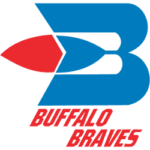
 Just a year after the team and its logo were created, the manager decided to change the design and improve its appearance. The designer hired to create their logo made a large "B" in sky blue, with a sizeable Indian feather in the middle that was half sky blue and half bright red. And finally, to mention the most crucial detail. The team's name is written in bright red letters below the capital letter "B."
1979-1982: Setting Sail to San Diego
In 1979, the basketball team changed not only its logo but also its location. They moved to San Diego, California, and changed their name to the Clippers, derived from the ships that sailed in San Diego. Their new logo consisted of 5 elements. A large blue circle symbolizes the ocean, and at the top, there is a smaller red circle that symbolizes the sun. Below are 3 white triangles that represent the ship sails, and at the bottom, in small letters in blue, is the city of San Diego, and below that, in bright red, is the team name "Clippers."
1983-1984: San Diego Clippers Logo Rebrand
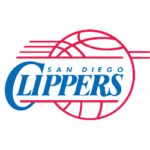
 A few years later, in 1983, at the request of the team manager, the designers made a general change to the logo. They spelled out "San Diego Clippers" in large type in blue and placed it as the central element in the center of the logo. Around it, they make red lines in the shape of a basketball.
1985 - 2015: Logo Update with the Move to Los Angeles
Just a year later, in 1985, the squad moved its headquarters from San Diego to Los Angeles. The style of the logo remained much the same. Only in the upper right corner of the ball were two of the features removed, and the lettering changed from "San Diego Clippers" to "Los Angeles Clippers."
Los Angeles Clippers Сlub Through the Ages
The Los Angeles Clippers club, also known as the Buffalo Braves, was founded in 1970. I'll surprise you with this fact, but their original headquarters was in New York City. Their start was disastrous and unsuccessful until Bob McAdoo joined the team. Then, the LA Clippers made a turnaround and started a winning streak.
Moving from New York to San Diego
In 1978, the team moved to San Diego and adopted a new name, the Clippers, derived from the small sailboats that cruised the bay harbor. In the first year of this change, they achieved a memorable victory because it was their last for the next 13 years.
New start in LA
A few years later, in 1981, the team was purchased and moved to Los Angeles. The lawyer who bought the squad and had high hopes for it failed. Due to his lack of managerial skills and strong character, he brought the team to such a position that by 1987, it had 12 wins and 60 losses.
Clippers Rising: A New Era with Steve Ballmer

Everything started falling into place for the Clippers only in 2013 when the National Basketball Association (NBA) allowed them to be sold to the Boston Celtics in exchange for their coach, Doc Rivers. In 2014, the club achieved 57 wins, and a year later nearly won the Western Conference Finals.
Due to many reasons and conflicts, the Basketball Association forced the team to be sold, and Steve Ballmer purchased the squad for $2 billion. As of 2015, the crew is in its prime, and it looks like its best and most successful years are ahead!
FAQ
Why is the basketball team named the Clippers?
Due to its change of location from Buffalo to San Diego, the team takes the name of the small sailboats that once roamed the bay of the city the team has moved to.
What does the team logo consist of?
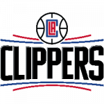
The team logo is made up of various components. The main element is the wordmark, the black text "CLIPPERS." It is set between four jagged stripes, two in red and two in blue. At the top, in the center, is a basketball with a distinctive red and blue LAC monogram inside.
___
Sports Logo History is a vibrant community of sports logo enthusiasts who share a deep appreciation for the captivating histories behind each team's logo. We take pleasure in exploring the evolution of primary logos, alternate logos, and wordmark logos from renowned leagues such as the NFL, NBA, MLB, MLS, NHL, Premier League, WNBA, CFL, NCAA, ABA, USFL, AAF, and XFL. Immerse yourself in the intricate details and stories behind these iconic symbols that represent the essence of each team.
In the enthralling realm of sports, the battle of logos among different leagues unfolds as a captivating and ongoing spectacle. Step into the world of Sports Logo History, where we showcase the relentless pursuit of distinction by leagues such as the NFL, NBA, MLB, Premier League, and countless others. Witness the captivating journey as each league strives to create logos that not only capture the essence of their sport but also resonate deeply with fans.
Immerse yourself in the comprehensive sports history provided by Sports Team History, our esteemed partner site, where you can discover the triumphs, challenges, and defining moments that have shaped the legacies of professional sports teams. Stay up to date with the latest sports news through Sports News History, a platform delivering 24/7 coverage of highlights, player interviews, and game analyses. Additionally, express your unwavering support for your favorite teams by exploring Sports Market History, the premier sports team marketplace offering a vast selection of jerseys, memorabilia, and collectibles. Join our community today and celebrate the rich history, iconic logos, and passion of sports.

