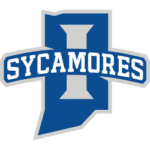
Indiana State, whose history includes head coach John Wooden and star player Larry Bird leading the school to National Championship game against Michigan State Spartans, has refreshed their athletic branding for a new generation of Sycamores.
The primary logo remains a blue silhouette of the state of Indiana, but the current one has more streamlined edges and is outlined in silver.
The old logo had a star in it to identify the school's location of Terre Haute. The new logo no longer has that and is replaced with a capital "I" in silver that spans most of the state. The school said this change was made to show that it represents the entire state rather than just the city that it's located in.

Indiana State Sycamores Primary Logo 2020 - Present
The most noticeable change comes in the scripting of the Sycamores nickname in the logo. The old font was a cursive script that screamed 1980s. The current one is in all-capital block letters; it's white text, outlined in blue, and then with a silver border around the word, similar to the outline that covers the state.
In a press release, the school expressed the need for a modern look:
"From a visual standpoint, the current logo simply looks outdated. The logo was last redesigned in 1988, prior to the advent of digital technology that allows for athletic marks to be more current and modern. Simply put, the existing primary logo appears old and antiquated, which negatively affects Indiana State from a national perception, fan engagement and recruiting standpoint. Modernizing the logo, while paying tribute to the history of the mark, will allow Indiana State to recruit better, build a better national perception and engage a new generation of fans."
The concept of the logo change began in the spring of 2018 and took two years to complete, and the school is proud of the modernized look.
“This is an exciting day for Indiana State University and the fans of our teams,” said university president Dr. Deborah Curtis. “We have a modern logo for athletics that projects power, respects tradition and honors our great state.”

Indiana State Sycamores Wordmark Logo 2020 - Present
The school's wordmark logo has also been streamlined. The silver "I" inside the state serves as the first letter of the words Indiana State, which uses the same block letter font with blue text and silver outline. The "S" in Sycamores is also created out of the state outline.
The Sycamores, which are most well-known from their basketball successes of the past and last made the NCAA Tournament as Missouri Valley Conference champions in 2011, will begin using the logos in earnest during the 2020-21 school year. The new logo officially debuted on the men's basketball team's warm-up jerseys during the MVC's conference tournament in early March.
See the Indiana State Sycamores logo history.
___
Sports Logo History is a vibrant community of sports logo enthusiasts who share a deep appreciation for the captivating histories behind each team's logo. We take pleasure in exploring the evolution of primary logos, alternate logos, and wordmark logos from renowned leagues such as the NFL, NBA, MLB, MLS, NHL, Premier League, WNBA, CFL, NCAA, UFL, ABA, USFL, AAF, and XFL. Immerse yourself in the intricate details and stories behind these iconic symbols that represent the essence of each team.
In the enthralling realm of sports, the battle of logos among different leagues unfolds as a captivating and ongoing spectacle. Step into the world of Sports Logo History, where we showcase the relentless pursuit of distinction by leagues such as the NFL, NBA, MLB, Premier League, and countless others. Witness the captivating journey as each league strives to create logos that not only capture the essence of their sport but also resonate deeply with fans.
Immerse yourself in the comprehensive sports history provided by Sports Team History, our esteemed partner site, where you can discover the triumphs, challenges, and defining moments that have shaped the legacies of professional sports teams. Stay up to date with the latest sports news through Sports News History, a platform delivering 24/7 coverage of highlights, player interviews, and game analyses. Additionally, express your unwavering support for your favorite teams by exploring Sports Store History, the premier sports team marketplace offering a vast selection of jerseys, memorabilia, and collectibles. Join our community today and celebrate the rich history, iconic logos, and passion of sports.

