Since their inception, the Denver Nuggets have undergone several transformations, both in their performance on the court and their branding off of it. Their logo is one of the most striking and indicative elements of their evolving identity.
From the initial design in 1967, when they were first recognized as the Denver Larks of the ABA, to their present NBA emblem, the Nuggets' logo has endured a fascinating journey. This progression reflects changes in design trends over time and parallels the team's growth and development. Let us embark on this journey to explore the history and evolution of the Nuggets logo.
1967 – 1971
 The genesis of the Denver Nuggets' visual identity can be traced back to 1967 when the team operated under the name "Denver Rockets” (They were initially called the Larks but changed their name before their first game). The very first logo was simplistic yet impactful. A crimson basketball was situated in the center of a white roundel, encircled by a dual outline in black and red, embodying the team’s energy and dynamism.
A vibrant red banner, running horizontally across the basketball, bore the bold, sans-serif inscription "Rockets," alluding to the team's original moniker. The surrounding perimeter of the basketball featured the phrase "Denver Kingsby System," etched in black over a white backdrop, a design element that further enriched the logo's narrative. This original logo embodied minimalistic elegance, setting the foundation for the team's visual identity in the coming years.
1971 – 1974
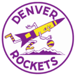
The previously minimalistic design was replaced with a whimsical, colorful caricature. The emblem now featured a vibrant, animated rocket, its fuselage painted in hues of yellow and purple, dashing across mountain peaks with a basketball clasped firmly in its grasp. This visual transformation was not just a shift in design direction but also an attempt to inject playful energy and dynamism into the team's image.
The team's name, now spelled out in all capital letters, was neatly arrayed along the circular perimeter of the logo. Crafted in a robust, sans-serif typeface and rendered in a bold purple, the wordmark complemented the emblem's vibrancy while retaining a sense of authority and resilience. With its lively cartoon rocket and vivid color palette, this logo symbolized a fresh chapter in the Nuggets' visual narrative, reflecting their evolving identity and ambition.
1974 – 1976
 1974 was a landmark in the club’s history, witnessing the merger of the ABA and NBA leagues. Consequently, the Denver Rockets had to change their name to the Denver Nuggets, as the team was already named the Rockets in the new league (Houston). This significant change was reflected in the team's logo.
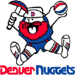
The reinvented emblem introduced a humorous character to the mix - a blue, red, and white depiction of a bearded miner, later nicknamed 'Maxie the Miner.' This lively figure was illustrated by leaping over a stylish sans-serif inscription in red and blue, representing the new team name. Maxie's playful design and bold typography signaled a new era for the team, effectively capturing their spirit of resilience and adaptability. Underneath Maxie was the team name, with “Denver” in red and “Nuggets” in blue. This logo became an instant favorite among fans and remains a cherished part of the team's visual history.
1976 – 1981
This period saw the Nuggets refine their logo, keeping the beloved character, Maxie the Miner, but enhancing him for a stronger visual impact. The colors of Maxie's clothing and beard were darkened, radiating a more robust and vibrant image. The lines that defined Maxie and his surroundings were emboldened and cleaned up, providing a more polished and professional appearance.
The Nuggets’ branding was also revamped, with the team name now appearing in a more assertive and bold font, still red and blue. Though a slight departure from the previous version, this logo iteration maintained Maxie's charm while effectively communicating the team's growing professionalism and ambition. With its rich color palette and captivating imagery, this logo encapsulates a favorable period in the team's history, symbolizing their steady progression and tenacity.
1981 – 1993
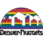
 Eschewing the whimsical and cartoonish elements of the previous logos, this new design adopted a sleek, modern aesthetic. The emblem was a half-circle with its upper part arched from the center, executed in a vibrant rainbow palette. Against this backdrop, a stylized Denver skyline and white mountain peaks were illustrated, resonating with the local landscape and the team's rootedness in the region.
Underneath this image was the word "Denver Nuggets" in a bold, black typeface - a design element from the previous logo. This design was steeped in the contemporary disco aesthetics of the early 1980s, signaling the team's readiness to embrace change and evolve along with the trends of the time. This logo remained the team's visual identity for over a decade, marking one of the most extended periods of unchanged status in the team's logo history.
1993 – 2003
The 1993 season it has ushered in a fresh era for the Nuggets' visual identity. The team unveiled a new logo, showcasing a sleek and elegant badge design. The primary image was a royal blue and white mountain range, a nod to Denver's geographical location and majestic landscape. The mountains were encased in a red-arched banner, which bore the inscription "Denver" in white, reinforcing the team's strong connection to its home city.
Below the banner, the word "Nuggets" was presented in a large, bold, gold serif typeface, serving as the focal point of the logo. This color choice was significant, as gold represents success, quality, and high standards - ideals the team continually strives for. This logo was a departure from the previous designs, leaving behind the cartoonish elements and moving towards a more sophisticated and contemporary image.
2003 – 2008
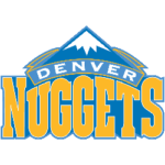
 The 2003 logo redesign significantly shifted the Nuggets' visual identity. The image of the mountains was simplified and stylized, adopting clean, crisp lines and an updated color palette of white, blue, and yellow.
The new colors brought the logo a sense of brightness and freshness, reflecting the team's growth and progress. The word "Denver" was retained in the arch on the mountains, albeit in a more modern, sans-serif typeface, while "Nuggets" was enlarged and presented in a striking yellow color, further emphasizing the team's name.
2008 – 2018
The shades of blue and yellow became darker and more intense in the 2008 re-design. The arched banner was now executed in a lighter, ice-blue hue - a fitting reflection of Colorado's famous mountains' cold, snowy peaks.
The word "Nuggets," displayed in a robust and dominating typeface, was in white, offering a striking contrast against the darker backdrop. This period was marked by the Nuggets' commitment to directly incorporate elements of their home environment into their emblem, effectively grounding their identity in Colorado's landscape's rugged beauty and resilience.
2018 – Today
 In 2018, the Nuggets revealed a wholly redesigned logo. The new identity is a dark blue circular badge with a white frame, trimmed with double outlines in yellow and red. Two mining hammers are crossed in the center of the insignia, over a yellow and white basketball and below a picture of snow-capped mountains. Surrounding these elements, bright white lettering spells out the team's name along the badge's perimeter. The two parts of the inscription are separated from each other by two fancy yellow stars.
This logo fortifies the Nuggets' connection to their home state's rich mining history and majestic landscape while signaling a new era in the team's visual narrative. It is a testament to the team's resilience, adaptability, and relentless pursuit of excellence, effectively capturing the spirit of this current period in the Nuggets' history.
The Bottom Line
The Denver Nuggets' logo evolution is a testament to the team's ability to adapt and evolve while remaining true to their roots. Each iteration of the logo captures the spirit of the times and the team's ambitions, reflecting their growth and progress.
Today, the logo symbolizes the Nuggets' connection to their home state's rich mining history and majestic landscape, signaling a new era in the team's visual narrative. It's a testament to their resilience, adaptability, and relentless pursuit of excellence, capturing the spirit of this current period in the Nuggets' history.
Looking forward, the Nuggets will continue to push boundaries and strive for success on the court. As a fan, you can stay connected to the team and show your support by checking out the FanDuel odds on NBA games. Get in on the action and join the excitement as the Nuggets continue to make their mark in the league.
___
Sports Logo History is a vibrant community of sports logo enthusiasts who share a deep appreciation for the captivating histories behind each team's logo. We take pleasure in exploring the evolution of primary logos, alternate logos, and wordmark logos from renowned leagues such as the NFL, NBA, MLB, MLS, NHL, Premier League, WNBA, CFL, NCAA, ABA, USFL, AAF, and XFL. Immerse yourself in the intricate details and stories behind these iconic symbols that represent the essence of each team.
In the enthralling realm of sports, the battle of logos among different leagues unfolds as a captivating and ongoing spectacle. Step into the world of Sports Logo History, where we showcase the relentless pursuit of distinction by leagues such as the NFL, NBA, MLB, Premier League, and countless others. Witness the captivating journey as each league strives to create logos that not only capture the essence of their sport but also resonate deeply with fans.
Immerse yourself in the comprehensive sports history provided by Sports Team History, our esteemed partner site, where you can discover the triumphs, challenges, and defining moments that have shaped the legacies of professional sports teams. Stay up to date with the latest sports news through Sports News History, a platform delivering 24/7 coverage of highlights, player interviews, and game analyses. Additionally, express your unwavering support for your favorite teams by exploring Sports Market History, the premier sports team marketplace offering a vast selection of jerseys, memorabilia, and collectibles. Join our community today and celebrate the rich history, iconic logos, and passion of sports.

