All fans of Manchester City can easily recognize their favorite club by its legendary colors and logo. A straightforward and simple yet effective and iconic logo has long become a symbol of ambitiousness, victorious spirit, and championship. Still, even long-standing fans of the cult football club might not know everything about the long way the Manchester City logo has come to become that glorious shield suggestive of its victories and grandiose achievements in the world of professional football. Let’s take a look at a brief history of Manchester City logo transformations that date back to the end of the 19th century.
1880-1894
In 1880, Manchester City was called St. Mark’s FC. And it wasn’t just the club’s name that was different. The logo was much simpler and restrained. (After all, there was no icon maker online that could help the team put together an effective emblem back then.) Executed in black and white, the 1880 insignia represented a round emblem with a wide frame. You could see a conspicuous white cross in the center of the composition. Placed against the black backdrop, it emphasized the chivalric and religious spirit of the club. The white logotype reading ‘St. Mark’s West Gordon’ and the ‘1880’ date mark were executed in white and placed between two circles of a double outline. Overall, the first emblem was quite ascetic in terms of visual adornment.
1894-2011
 Sports Logo History
 Manchester United FC Primary Logo 1902 - 1943
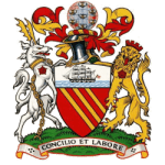
Once the club had been renamed Manchester City, it hurried up and changed its logo to a more pretentious one. A new heraldic image boasted bold colors and animalistic elements that couldn’t but draw a beholder’s eye. The new coat of arms featured an orange shield with the clipper slicing through the blue waves, which was destined to become a signature element of Manchester City’s insignia. The focal point, though, is mythical creatures resembling a lion and a deer, pridefully holding the shield. The inscription at the foot of the emblem read, ‘Concilio et Labore,’ which means ‘Wisdom and Effort.’
1961-1976
 Sports Logo History
 Manchester City FC Primary Logo 1960 - 1970
Much less pretentious than the Manchester City logo became in the 1960s. Both animals and colorful vignettes that could be found on top of the 1894 emblem disappeared from the new logo. A more simplified version of the insignia contained a traditional striped shield and clipped, which was then executed in yellow. The entire composition was enclosed in the navy blue frame with the traditional Manchester City F.C. caption within.
It would be fair to note that the logomark in question underwent some minor changes in 1970. The pattern was slightly modified and the colors in which the major logotype elements were executed became brighter. The shield’s lines became thicker, while the clipper became more compact in size and appeared on a white background.
1972-1997
 Sports Logo History
 Manchester City FC Primary Logo 1972 - 1976
It wasn’t until 1972 that the Manchester City football club introduced particularly noticeable changes to its logo. At that time, the logomark was spiced up with the red rose of Lancashire, which not only replaced habitual stripes but also injected some romantic chic into the hitherto restrained emblem. The rose was placed on the white background, and the wavy lines under the permanent clipper also became white. The lettering in a modern-looking font was encircled in a white frame.
1997-2016
 Sports Logo History
 Manchester City FC Primary Logo 1997 - 2016
Truly revolutionary changes arrived in 1997, which made the entire look of the familiar emblem more imperious and ostentatious. One couldn't help but notice the three golden stars at the top of the logo. They symbolized the club’s grandeur and superiority claim in the world of professional sport. The traditional shield showed the abbreviated version of the club’s full name, M.C.F.C., and sported the familiar striped, which then were executed in white. The clipper’s color also underwent changes and became golden, just like the imperious eagle holding it. At the foot of the shield, there was a new motto ‘Superbia In Proelio,’ which translates to ‘Pride in Battle.’ Thus, the new logo celebrated the team’s unbreakable spirit and strive for victories on the football field.
2016 – Present
 Sports Logo History
 Manchester City FC Primary Logo 2016 - Present
The golden eagle logo has served the club for almost twenty years. But in 2016, it was decided to give the emblem a more traditional look. Thus, the fans welcomed the familiar rounded emblem with the habitual Manchester City word mark and the 1896 date mark executed in deep blue. The red rose also made its sensational comeback and was placed at the bottom of the shield against the striped light blue backdrop. They also opted for more formidable double circle framing, which looked more stylish and formidable.
Currently, Manchester City fans can enjoy this version of a logo every time they watch football matches of their favorite team. But, who knows? They might want to spruce up their emblem with new elements, slightly tweak, or completely overhaul their logo design in the future. Time will tell.
Sports Logo History is a community of sports logo enthusiast who enjoys the history of each team’s logo history. Sports Logo History has primary logos, alternate logos, or wordmark logos from the NFL, NBA, MLB, MLS, NHL, Premier League, WNBA, CFL, NCAA, ABA, USFL, AAF, and XFL.
Our partner site is Sports Team History takes a look at the history of each and every professional sports team. In addition, we have added Sports News History to our sports history websites. 24/7 non-stop sports news that's worth knowing. Finally, the premier sports team marketplace for your favorite team or college with thousands of items for you to peruse at Sports Market History.

