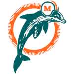
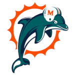
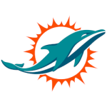
Since the Miami Dolphins' inception in 1966, their logo has undergone several transformations, each reflecting shifts in design trends and the franchise's evolving identity. This article examines the history and evolution of the Dolphins' logo, highlighting the significance of each version.
1966–1973: The Original Emblem

1974–1989: Subtle Refinements

1989–1996: Modernization Efforts

1997–2012: A Bold Redesign

Branding is critical in how teams are perceived, often influencing more than just merchandise sales or television appearances. The revamped logo reinforced the Dolphins' ambitions, building excitement around the franchise. This excitement naturally extended to conversations about team performance, game predictions, and betting culture. For many, the updated logo became synonymous with the team’s competitiveness during this period, shaping expectations and fueling discussions about Miami Dolphins odds before high-stakes games. The new design wasn’t just a visual upgrade—it became a symbol of hope and heightened anticipation for fans and analysts alike.
2013–2017: Sleek and Modern

2018–Present: Current Iteration

Throughout its history, the Miami Dolphins logo has evolved to mirror the team's identity and the aesthetic preferences of each era. Each iteration, from the original, playful design to the current sleek emblem, reflects the franchise's journey and connection to Miami's vibrant culture.
___
Sports Logo History is a vibrant community of sports logo enthusiasts who share a deep appreciation for the captivating histories behind each team's logo. We take pleasure in exploring the evolution of primary logos, alternate logos, and wordmark logos from renowned leagues such as the NFL, NBA, MLB, MLS, NHL, Premier League, WNBA, CFL, NCAA, UFL, ABA, USFL, AAF, and XFL. Immerse yourself in the intricate details and stories behind these iconic symbols that represent the essence of each team.
In the enthralling realm of sports, the battle of logos among different leagues unfolds as a captivating and ongoing spectacle. Step into the world of Sports Logo History, where we showcase the relentless pursuit of distinction by leagues such as the NFL, NBA, MLB, Premier League, and countless others. Witness the captivating journey as each league strives to create logos that not only capture the essence of their sport but also resonate deeply with fans.
Immerse yourself in the comprehensive sports history provided by Sports Team History, our esteemed partner site, where you can discover the triumphs, challenges, and defining moments that have shaped the legacies of professional sports teams. Stay up to date with the latest sports news through Sports News History, a platform delivering 24/7 coverage of highlights, player interviews, and game analyses. Additionally, express your unwavering support for your favorite teams by exploring Sports Store History, the premier sports team marketplace offering a vast selection of jerseys, memorabilia, and collectibles. Join our community today and celebrate the rich history, iconic logos, and passion of sports.

