It is no secret that the Auburn Tigers have a rich and abundant history in college athletics. Their history in athletics dates back to the time when the university was called the Agricultural and Mechanical College of Alabama. Shortly after, the university was renamed Alabama Polytechnic Institute in 1899 before being renamed Auburn University six decades later.
Since being officially recognized by Auburn University, the school has only had two logos since 1957. Its current brand identifier has been in existence since 1966. This university has been a long-time member of the SEC for decades.
There is no doubt that this is a top-tier athletic program with very notable alumni. Three Heisman Trophy winners have played for Auburn:
Pat Sullivan (1971),
Bo Jackson (1985)
Cam Newton (2010)
Bo Jackson is the cream of the crop, as it is arguable that he may be the most outstanding two-sport professional athlete in history.
Another notable alumnus of Auburn University is NBA Hall of Famer Charles Barkley.
A university cannot have only two brand identifiers in 6+ decades without some significant success as its foundation.
In this piece, we will examine Auburn University's logo history and the reasons behind its enduring popularity. Unfortunately, no instant withdrawal casinos are evaluated here.
Until 1957, Auburn University’s original logo featured an orange “A” wordmark on an orange background, a design that remained in use for several decades.
The football program's momentum could have influenced Auburn University's decision to switch its logo. Before 1957, Auburn University had four straight seasons of seven wins or more.
In 1957, the logo was updated to feature an aggressive-looking orange tiger. The tiger has a dark blue outline for its eyebrows and cheekbones, as well as a white and dark blue outer trim. His eyes look as if he is noticing something that upsets or annoys him. On top of his head, one can see that he is wearing a tiny sailor hat.
The top of the sailor hat is orange, while the rest is blue. Within the blue portion of the sailor hat, one can see that there is an orange “A” wordmark. This logo was used from 1957 to 1966.
Auburn University’s football program had great success during its time under its brand identifier. Auburn University went undefeated and won the national championship in 1957.
Interestingly enough, the momentum for Auburn University’s football program had slowed by 1965.
Coincidentally, Auburn University would switch its primary logo one year later.
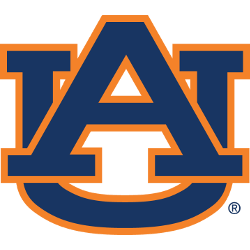
 In 1966, Auburn University switched to an interlocking “AU” wordmark. Of course, “AU” stands for Auburn University. The bold “A” wordmark is visible first. It slightly conceals the “U” wordmark. The “U” wordmark is partially covered, revealing the top of the “U” and part of its base. The middle of the “U” wordmark is covered by the “A” wordmark.
Both wordmarks are colored dark blue and feature an outer trim colored orange.
This is a reversal from the last logo, in which orange was dominant while dark blue accentuated its characteristics.
Auburn University has had this logo for 58 consecutive years. This is no surprise, given that the Auburn football program has had winning seasons for 42 of those 58 years.
In 2010, Auburn University won its second national championship by going undefeated, thanks to Cam Newton's stellar play.
Auburn University's football program is the thirteenth-winningest in the FBS's history. It is no wonder the logo has had such significant longevity.
One can argue that the school's basketball program played a significant role in the longevity of its primary logo. The success of the Auburn University basketball program has come primarily during the period of its current logo.
Auburn University has had 14 NCAA tournament appearances within the past 40 years. The team has made five Sweet Sixteen appearances, one Elite Eight appearance, and one Final Four appearance.
___
Sports Logo History is a vibrant community of sports logo enthusiasts who share a deep appreciation for the captivating histories behind each team's logo. We take pleasure in exploring the evolution of primary logos, alternate logos, and wordmark logos from renowned leagues such as the NFL, NBA, MLB, MLS, NHL, Premier League, WNBA, CFL, NCAA, UFL, ABA, USFL, AAF, and XFL. Immerse yourself in the intricate details and stories behind these iconic symbols that represent the essence of each team.
In the enthralling realm of sports, the battle of logos among different leagues unfolds as a captivating and ongoing spectacle. Step into the world of Sports Logo History, where we showcase the relentless pursuit of distinction by leagues such as the NFL, NBA, MLB, Premier League, and countless others. Witness the captivating journey as each league strives to create logos that not only capture the essence of their sport but also resonate deeply with fans.
Immerse yourself in the comprehensive sports history provided by Sports Team History, our esteemed partner site, where you can discover the triumphs, challenges, and defining moments that have shaped the legacies of professional sports teams. Stay up to date with the latest sports news through Sports News History, a platform delivering 24/7 coverage of highlights, player interviews, and game analyses. Additionally, express your unwavering support for your favorite teams by exploring Sports Store History, the premier sports team marketplace offering a vast selection of jerseys, memorabilia, and collectibles. Join our community today and celebrate the rich history, iconic logos, and passion of sports.

