The Brentford Football Club has come a long way since its inception. Known to their followers and fans as the Bees, the team has been conquering the football terrain in the English Premier League since 2020.
The club boasts a wide fan base across the world, and its presence is particularly strong in places like Perth, which fosters a thriving sports betting culture. In fact, gambling in general is a popular hobby as many play games at online casino in Perth, while figuring out which teams they should put on their betting slip. Bettors here closely follow Premier League teams and games and know all sorts of trivia about FC logos. To that end, we’ll discuss Brentford’s primary logo, its origins, and how it changed over the years, from 1889 to the present day.
Brentford FC Team Quick Overview
England’s Brentford FC boasts a remarkably long and intriguing history. The team’s original logo took many shapes over time. Based in Brentford, West London, the Brentford Football Club used its original logo back in 1889. In fact, it was around that time that the club was founded by Fred Hargreaves and his brother-in-law, Henry Price.
Since the club’s formation, the team has played in numerous stadiums, often shifting grounds as it grew. Below, we’ve gathered a list of all stadiums Brenftord FC played on over time:
- Clifden Road (1889-1891)
- Benn’s Field (1891-1895)
- Shotter’s Field (1895-1898)
- Cross Roads (1898-1900)
- York Road (1900-1904)
- Griffin Park (1904-2020)
- Gtech/Brentford Community Stadium (2021-present)
Brentford FC Logo Through Time
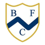
Let’s see how the team’s logo changed over time, starting with 1893.
1893 - 1909

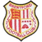
1909 - 1965
In 1909, the club switched from white and gold to a red shield. The crest had three swords running through it, with a crown on top. This crest is known as the Middlesex coat of arms, and was granted to Essex County Council back in 1932.
1965 - 1972

Inside the crest, there were four quadrants:
- Two with white and red stripes
- One with five stars and a beehive below them
- One with three yellow swords on a red background
1972 - 1975
The club changed the logo again in 1972, replacing the shield design with a round-shaped crest. The new circular crest included four red and three white stripes in the upper half, and a red and white bumblebee in the lower half. The bumblebee and the stripes were surrounded by black lettering, with the wordmark “Brentford F.C.” on top, and “Founded 1888” at the bottom.
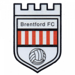
1975 - 1994

The team’s long history suggests that this logo was meant to celebrate the club’s immense success at Griffin Park. Between 1929 and 1930, the team set a record with 21 home wins in a single season.
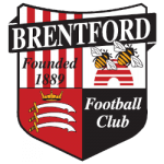
1994 - 2017

- One with four white and four red stripes, and black “Founded 1889” lettering
- One with two yellow and black bees on top of a red beehive
- One with three swords and a crown on top of a red background
- One with a black background and white “Football Club” wordmark.
The logo also included one last but crucial detail: a black banner running across the crest with white “BRENTFORD” lettering.
2017 - Present
In 2017, the team switched back to a circular logo featuring a black, yellow, and white bumblebee in the center on a white circle background. The new crest featured two circular backgrounds in red and white, bordered with black and white trim.
The “BRENTFORD” lettering in white sits on top, while the white “FOOTBALL CLUB” wordmark occupies the bottom. The split year of 1889 in white adds an extra touch, with 18 and 89 positioned on the left and right center. It was this logo that launched the club to the Premier League in 2021.
Wrapping It Up
So, there it is; the short but sweet history of the Brentford FC logo and its numerous iterations over time. The team’s story of achievements is only preceded by the rich testimony of the club’s crest, which successfully withstood the test of time.
The team has left a lasting mark on the local soccer community, with its logo standing in the middle of it all as a bright sigil. It’s a silent and timeless witness to the club’s undeniable determination that led the team to glory.
===
Sports Logo History is a vibrant community of sports logo enthusiasts who share a deep appreciation for the captivating histories behind each team's logo. We take pleasure in exploring the evolution of primary logos, alternate logos, and wordmark logos from renowned leagues such as the NFL, NBA, MLB, MLS, NHL, Premier League, WNBA, CFL, NCAA, UFL, ABA, USFL, AAF, and XFL. Immerse yourself in the intricate details and stories behind these iconic symbols that represent the essence of each team.
In the enthralling realm of sports, the battle of logos among different leagues unfolds as a captivating and ongoing spectacle. Step into the world of Sports Logo History, where we showcase the relentless pursuit of distinction by leagues such as the NFL, NBA, MLB, Premier League, and countless others. Witness the captivating journey as each league strives to create logos that not only capture the essence of their sport but also resonate deeply with fans.
Immerse yourself in the comprehensive sports history provided by Sports Team History, our esteemed partner site, where you can discover the triumphs, challenges, and defining moments that have shaped the legacies of professional sports teams. Stay up to date with the latest sports news through Sports News History, a platform delivering 24/7 coverage of highlights, player interviews, and game analyses. Additionally, express your unwavering support for your favorite teams by exploring Sports Store History, the premier sports team marketplace offering a vast selection of jerseys, memorabilia, and collectibles. Join our community today and celebrate the rich history, iconic logos, and passion of sports.

