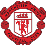
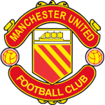
In the world of football - and sports in general- very few logos are as iconic or enduring as the Manchester United football club. The club’s emblem - The Manchester United Crest, has stood the test of time for well over 100 years… and its exciting history, classic design, and unfailing connection to the heart and soul of the city of Manchester have all contributed to its unrivaled endurance and longevity.
The History of the Manchester United Logo
The roots of the Manchester United logo go back to the club's earliest days. Manchester United was founded in 1878 - under the name Newton Heath LYR Football Club - and, as you can imagine, the logo was very different. The original logo was of a football intertwined with the letter LYRFC (Lancashire and Yorkshire Railway Football Club).
 Sports Logo History
 However, in 1902, it underwent a massive transformation. The club was under financial pressure and had to be saved by a local brewer, John Henry Davis. It was he who renamed the team Manchester United - and it was he who introduced the very first iteration of the world-famous red devil emblem, representing tenacity and fighting spirit.
Over the years, the logo has undergone several changes and updates. Still, the main elements have remained the same - the red devil and the ship- a nod to the city’s connection to trade and commerce and its rich maritime heritage.
Why Has It Lasted So Long?
 Sports Logo History
 There are many reasons why the club’s famous logo has been so long-lasting…
Firstly, Manchester United isn’t just a football club. This cultural institution is rooted in the heart of the city - and the Manchester United logo is a part of the city’s identity, creating a solid bond between the club, the city, and the supporters.
What’s more, the logo is simple, elegant and well-designed. The Red Devil and its ship are instantly recognizable to anyone who knows anything about sport - and those who don’t. While the logo may have seen refinements and changes throughout the years, it has always remained loyal to its roots with a perfect balance between tradition and evolution, making it classic and modern all at once.
It’s also worth noting that Manchester United isn’t just property of England now - it’s a global brand. The logo’s universal recognition and appeal have become a massive part of Manchester United’s global branding.
This is particularly true just over the water, in Ireland… Indeed, the Premier League is as popular in Ireland as is Gaelic football - with as many people watching and betting on the Premier League as they check out the latest GAA odds at Boylesports. Manchester United is arguably one of the most popular sports teams - with its logo known by every sports fan in the country.
Changes in the Logo
Let’s look at some of the variations of the club logo…
- Color: The logo's colors have always been mainly red, white, and black - although there have been a few shade variations (usually because of different printing and display technologies).
- Typography: The font used for Manchester United has also changed over the years. They have gone from decorative fonts to modern, streamlined ones representing different eras.
- The Size and Shape: There have also been a few tweaks to the size and shape of the logo… generally to optimize how it looks on merchandise and different platforms.
Why It Has Stood the Test of Time
The Manchester United logo has lasted for years because it has adapted to the times but remained true to its identity.
Manchester United has always had a strong brand identity - the logo is central to that. For this reason, it manages to evoke a real deep emotional connection with its supporters, symbolizing the hopes and dreams of fans worldwide. To many, Manchester United isn’t just a football team but a symbol of the city, representing pride, spirit, and resilience. This is a symbol that represents excellence.
Wrap Up
Over the years, Manchester United has always strived for excellence - on and off the pitch, and this is represented in its logo. The logo is a testament to the enduring appeal of the Manchester United football club - as timeless and long-lasting as the club itself.
___
Sports Logo History is a vibrant community of sports logo enthusiasts who share a deep appreciation for the captivating histories behind each team's logo. We take pleasure in exploring the evolution of primary logos, alternate logos, and wordmark logos from renowned leagues such as the NFL, NBA, MLB, MLS, NHL, Premier League, WNBA, CFL, NCAA, ABA, USFL, AAF, and XFL. Immerse yourself in the intricate details and stories behind these iconic symbols that represent the essence of each team.
In the enthralling realm of sports, the battle of logos among different leagues unfolds as a captivating and ongoing spectacle. Step into the world of Sports Logo History, where we showcase the relentless pursuit of distinction by leagues such as the NFL, NBA, MLB, Premier League, and countless others. Witness the captivating journey as each league strives to create logos that not only capture the essence of their sport but also resonate deeply with fans.
Immerse yourself in the comprehensive sports history provided by Sports Team History, our esteemed partner site, where you can discover the triumphs, challenges, and defining moments that have shaped the legacies of professional sports teams. Stay up to date with the latest sports news through Sports News History, a platform delivering 24/7 coverage of highlights, player interviews, and game analyses. Additionally, express your unwavering support for your favorite teams by exploring Sports Market History, the premier sports team marketplace offering a vast selection of jerseys, memorabilia, and collectibles. Join our community today and celebrate the rich history, iconic logos, and passion of sports.

