 Sports Logo History
In 2023, the Vanderbilt Commodores will be celebrating its 150th anniversary of existence as an institution. Two days ago, the university announced a new change to its identity via a logo and watermark design change. Vanderbilt University athletic director Candice Lee described the occasion as a “new era” and a “new day.”
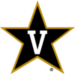
The university has had a very detailed history with regard to logos. From 1969 to 1983, the university’s logo consisted of a star outlined in gold trim. The inside of the star contained a black background with a gold “V.” In 1984 and 1985, the university switched to a streaking black star with a white outline. The star was placed right next to a gold-colored “V” with a small black outline. The university would switch to the previous logo from 1986 to 1990.
From 1991 to 1998, the logo would switch to a black and bold letter “V.” The middle of the logo contains a “VANDERBILT” wordmark in gold. Vanderbilt University would switch to a logo with a gold-colored V from 1999-2003. The V contains a small white outline as well as a bold black outline. A commodore dressed in black and gold can be seen in the middle of the logo with a sword in hand. Additionally, a “VANDERBILT” wordmark with a white and black outline can be seen right below the commodore.
From 2004 - 2007, the university would keep all the elements of the previous logo. The only difference is that the commodore can be no longer be seen in the middle of the logo.

Vanderbilt Commodores Primary Logo 2008 - Present
Their current logo was established in 2008. It consists of a black star with a gold outline. The inside of the star contains the white letter “V”.
The key common denominator for Vanderbilt University’s new logo is the “Block V.” It is vastly different from the star-shaped V’s of the past. A lot of research was done before deciding on this logo. The university sought the services of a design studio in Boston. The logo was decided after hundreds of surveys and numerous one-on-one interviews. Additionally, the university has a new color scheme: metallic gold and rich black.
Block V has also replaced the V that was used in the university’s academic logo. It can be seen prominently in the center of Vanderbilt’s new university seal. The seal happened to contain the university’s new motto: “Crescere Aude”.
While the star-shaped V logos of the past have been replaced as the team’s primary logo, it is still part of Vanderbilt’s logo package. Several star-shaped offerings are set to be utilized for team advertisements and merchandise.
The new logos will be worn by Vanderbilt University athletics in Fall 2023.
Sports Logo History is a community of sports logo enthusiast who enjoys the history of each team’s logo history. Sports Logo History has primary logos, alternate logos, or wordmark logos from the NFL, NBA, MLB, MLS, NHL, Premier League, WNBA, CFL, NCAA, ABA, USFL, AAF, and XFL.
Our partner site is Sports Team History takes a look at the history of each and every professional sports team. In addition, we have added Sports News History to our sports history websites. 24/7 non-stop sports news that's worth knowing. Finally, the premier sports team marketplace for your favorite team or college with thousands of items for you to peruse at Sports Market History.

