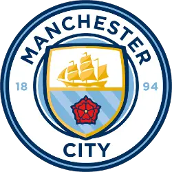
December 26, 2015, Manchester City introduced a new emblem of the club before the match with Sunderland. As promised, the Manchester City logo was designed in a round shape and executed in two colors: 94% of fans preferred the blue color, and 68% – the white one. Also, fans chose the elements of the picture: 85% appreciated a ship, the symbol of Manchester, 67% chose three rivers (Irwell, Irk and Medlock), and 60% picked out a red rose, the symbol of the county of Lancashire. The logo has a round shape again with a shield inside, where the golden ship and the red rose are featured. All the lines are painted in the dark blue color and complemented by light blue. The year of the club foundation is painted blue 1894. Finally, the arched wordmark is back “MANCHESTER CITY” in blue.