The Chicago Bears are one of the oldest franchises in the history of the National Football League. They are one of two franchises remaining from when the NFL originally started in 1920. They were found on September 20th, 1919, in Decatur, Illinois. For one year, they were known as the Decatur Staleys. After the franchise relocated to Chicago, they became …
A Look at the Kansas City Royals Sports Logo History
The Kansas City Royals franchise has existed since the year 1969. The team name “Royals” was derived from a semipro Negro League as well as a minor league Negro League baseball team with the same name. It was also inspired by the city’s annual “American Royal” event that takes place every year. The Royals achieved success not too long after …
Strong and Bold New Logo for Brown Bears
Just recently, it was revealed that Brown University’s athletic and recreation division has just released a new set of logos in order to provide a fresh start to its brand identity. According to Brown VP M. Grace Calhoun, this action represented a new day for Brown University. The school’s chief communication officer believes that the new logos would generate a …
What You May Not Know About Some Premier League Logos
The Premier League is one of the most famous football leagues in the world. There are iconic clubs playing in iconic kits at iconic stadiums that people enjoy globally. Some of these clubs play under famous logos, which may have some interesting facts you weren’t aware of. Read on to see what we mean. Liverpool You will be familiar with …
New Look and Branding for the Utah Jazz
When one thinks of the Utah Jazz, one cannot help but think about one of the greatest duos in NBA History: Karl Malone and John Stockton. Over the years, Utah Jazz has had many changes to its primary logo and brand identifiers throughout its franchise history ever since it started in New Orleans. Two days ago, Utah Jazz announced sweeping …
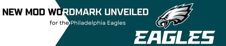
New Mod Wordmark Unveiled for the Philadelphia Eagles
The Philadelphia Eagles have had quite a few logos throughout their franchise history. This is especially the case when it comes to wordmark logos. The franchise’s current wordmark logo design first came into fruition in 1996. However, the franchise’s current wordmark logo is set to change as of last Thursday. On that day, the franchise introduced a new wordmark logo …
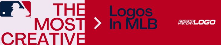
The Most Creative Logos In MLB
With batters staring down pitchers and the outfielders staring up to catch pop-up flies, baseball hats are a necessary utility in the sport. Today, baseball caps serve as more than just sun shields. Teams have been using them as effective branding tools, considering that it bears the team’s logo. Logos are a vital aspect of MLB teams, giving fans and …
The Evolution of the NFL Logo
To the extent that logos go, the group logos of the National Football League are probably the most perceived on the planet. Putting on everything from shirts to mugs to seats and even vehicles, it’s a thing of pride for an individual to flaunt their number one NFL group’s logo. Whether you’re a big or a casual fan, check out …
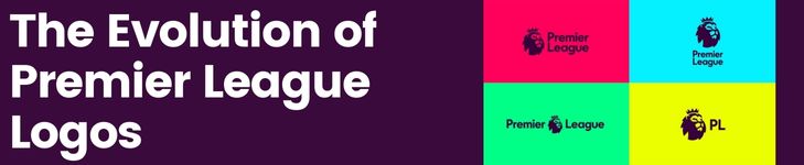
The Evolution of Premier League Logos
The lion on the Premier League logo is famous for being the best league in the history of football. The most talented, professional players are collected there. And crowds of fans come to watch Premier League matches. However, the history of English football has not always been so clear. Despite the enormous achievements of English football clubs in the European …
Updated Spirit Air Force Falcons Logo
This past Tuesday, the Air Force Academy announced a change to its main identifier. The new logo is meant to be an illustration of the commitment of the Air Force Academy to expand its leadership for the U.S Air Force as well as the U.S Space Force. The Air Force Academy has had an extensive primary logo history. In order …