Minnesota Timberwolves
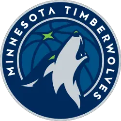
The logo has many nods to Minnesota, the team and, of course, the Timberwolf.
There’s the North Star which represents one of the pillars Minnesota hangs its hat on. The star represents Minnesota pride.
The new logo represents looking forward and carving out new territory. The open mouth with the teeth showing represents the fierce .energy of not just one Wolf, but a collective unit. To show aggression and fearlessness to the future. The green of the eyes is a nod to the green that surrounds the state whether that be through Northern Lights, reflection of ice crystals in the winter or the flourishing of buds of trees in the spring.
The primarily colors include midnight blue, aurora green, lake blue, moonlight grey and frost white.
“From the motion and vibrant hues of the Northern Lights, to the depths and reflections of a midnight forest, to the rich contrasts of this great frozen city of the north, the palette is the perfect representation of modern sport colors inspired by the story of Minnesota’s landscape,” Richardson said. “It’s color with a sense of place.”
For Richardson, he loves how the logo is simple, yet intense. The logo was designed by Rodney Richardson of RARE Design.